The growth of digital commerce shows no signs of slowing down.
While business-to-business (B2B) companies were a bit slower to jump on the digital train than business-to-consumer (B2C) companies, B2B ecommerce websites now represent a huge chunk of modern commerce.
B2B Ecommerce Growth
The importance of this channel is undeniable. The global B2B ecommerce market was valued at over $7 trillion USD in 2022. And it’s projected to grow at an annual rate of 18% through 2030.
The exceptional growth is fueled by an increasing demand for streamlined, user-friendly purchasing experiences.
As of 2022, 65% of B2B companies have integrated ecommerce into their sales channels. That’s a significant increase from 53% in the previous year.
What does this mean for your business?
Embracing ecommerce is no longer a luxury but a necessity for B2B companies that want to stay competitive in the market.
In this article, we look at 32 of the best B2B ecommerce website examples. Each exemplifies excellence as a digital sales channel and in their respective industry. We examine what sets these B2B ecommerce sites apart, focusing on their design, functionality, and overall user experience.
Whether you’re looking to improve an existing B2B ecommerce website or build one from scratch, incorporating learnings from the best B2B ecommerce website design examples can help you improve your own.
What Is a B2B Ecommerce Website?
A B2B ecommerce website is an online storefront where businesses sell products or services to other businesses.
There are six different types of ecommerce:
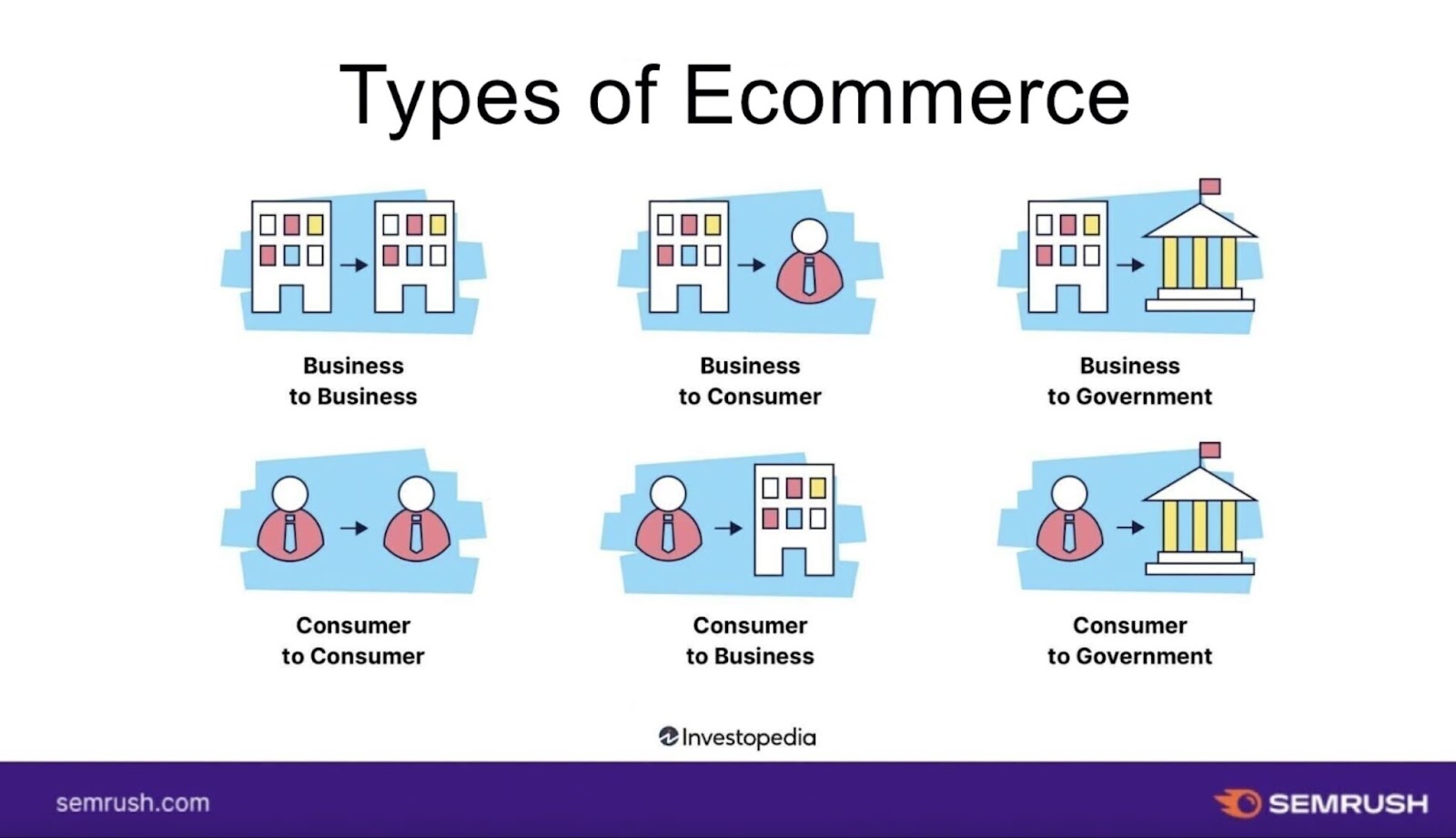
Unlike B2C and B2G websites, B2B websites cater to the unique needs of businesses.
Must-Have Features of a Successful B2B Ecommerce Website
Not sure where to start?
These 17 B2B ecommerce website features make a great roadmap to B2B ecommerce success.
1. Good Catalog Organization
Good organization of your product catalog helps facilitate user-friendly navigation, product discovery, and simplified decision-making for your buyers.
In B2C ecommerce, simplicity is often key. B2B buyers are often looking for products or complex services that check very specific boxes. Easily navigable catalogs are key so they can find them.
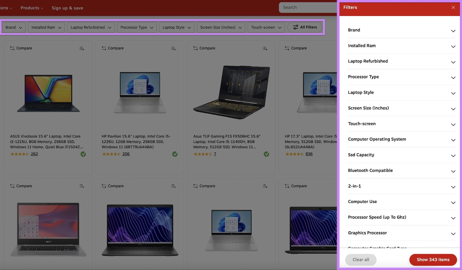
A well-organized catalog includes clear categorization and sub-categorization that lets B2B buyers locate items quickly.
Example: A B2B website (like Staples) selling computer components might categorize items by type, like motherboards or graphics cards, and further by brand or compatibility.
2. Comprehensive Product and Service Descriptions
Detailed product and service descriptions help B2B buyers make informed purchasing decisions, especially for technical or specialized solutions.
Effective product and service descriptions include basic information, technical specifications, use-case scenarios, feature rundowns, and compatibility details. This level of detail helps build trust and credibility with B2B buyers.
Example: Let’s say a B2B site is selling a software-as-a-service (SaaS) solution for small businesses. They would provide extensive details about the platform’s features, the industries it was built for, and the tool’s compatibility with existing systems and point-of-sale (POS) devices.
3. High-Quality Content
Engaging and informative content helps establish brand authority and aids in search engine optimization (SEO).
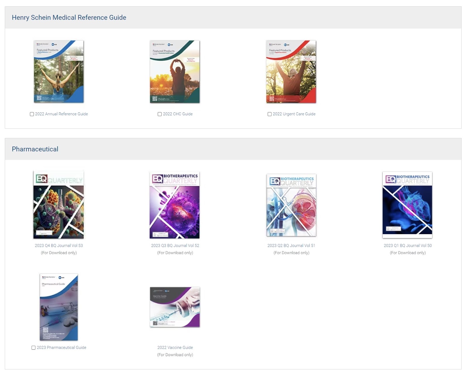
High-quality content on a B2B ecommerce website is not just about selling a product. It's about informing, educating, and engaging the buyer. This content could be detailed product guides, industry insights, case studies, or video demonstrations. This approach demonstrates product value and positions the brand as a knowledgeable leader in the field.
Example: A B2B ecommerce website like Henry Schein, which specializes in medical, dental, and veterinary supplies, might offer comprehensive guides on how their products streamline clinic operations. Or case studies highlighting successful implementations in various healthcare settings.
4. CTAs for Each Stage of the Customer Journey
A call to action (CTA) is a clear and direct message that encourages the reader to take a specific action. Like: signing up, buying a product, or learning more.
Effective CTAs on B2B ecommerce sites guide buyers along, step-by-step, until they purchase. This is called the customer journey. It’s the process that potential customers go through, from first learning about a product or service to making the final decision to purchase.
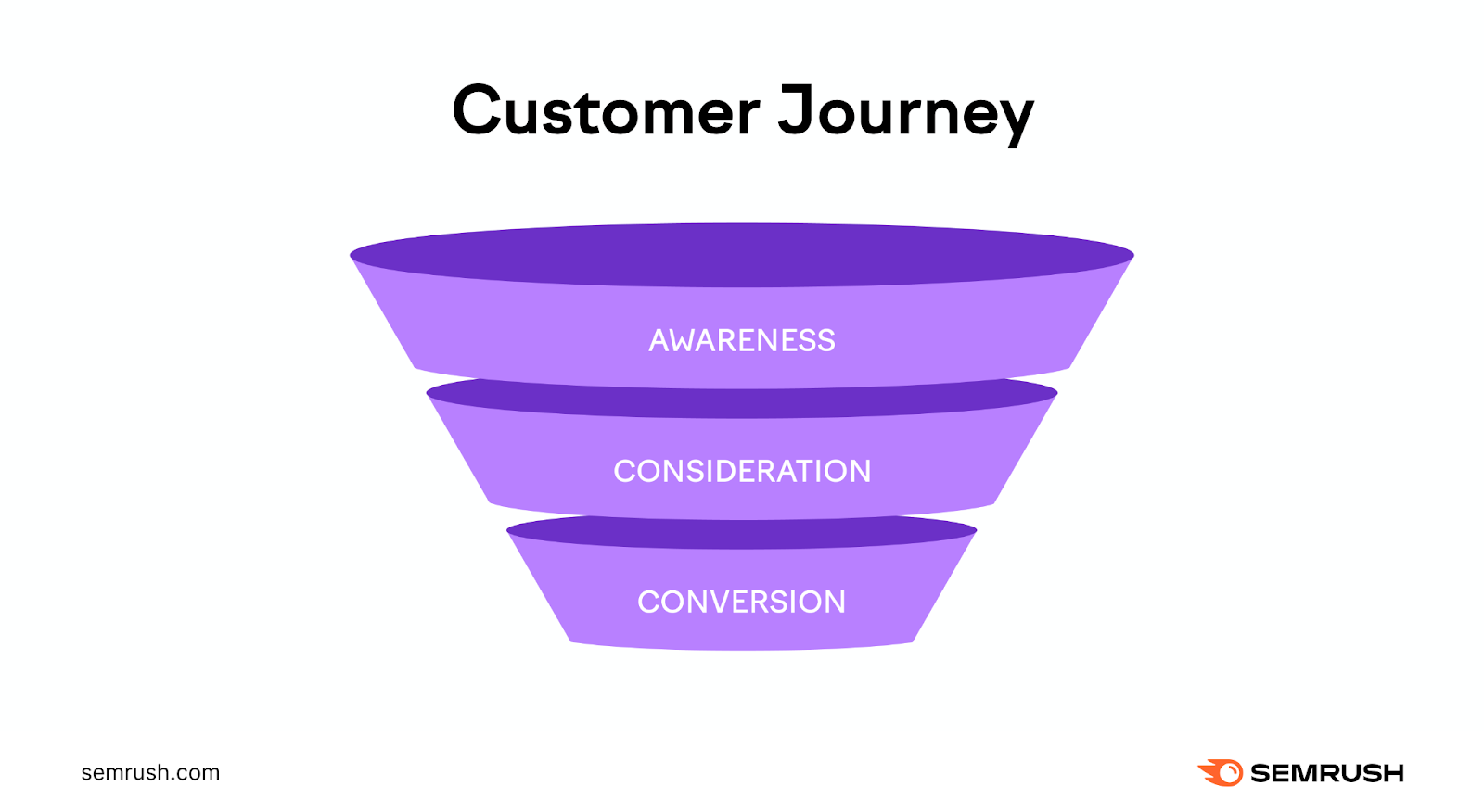
When choosing your CTAs, it helps to understand your customer’s journey.
A B2B sales cycle is often longer and more complex than B2C. That’s because they typically have higher transaction values, a larger number of decision-makers who need to sign off on purchases, and complex and lengthy contracts to review.
Follow B2B ecommerce website best practices by providing your buyers with CTAs to explore information relevant to their stage. And taking actions that effectively move them through it and onto the next one. This targeted approach ensures that CTAs are meaningful and effective in converting prospects to customers.
Example: You might encourage a new website visitor to subscribe to a newsletter. The early stages of the customer’s journey is where they gather introductory information. You might drive returning visitors to download a whitepaper for more in-depth information. Or request a demo or consultation. In the later stage of a customer’s journey, they are closer to buying.
5. Well-Designed UI/UX
The user interface (UI) and user experience (UX) design of a B2B ecommerce website play a major role in ensuring a smooth and efficient buyer’s experience.
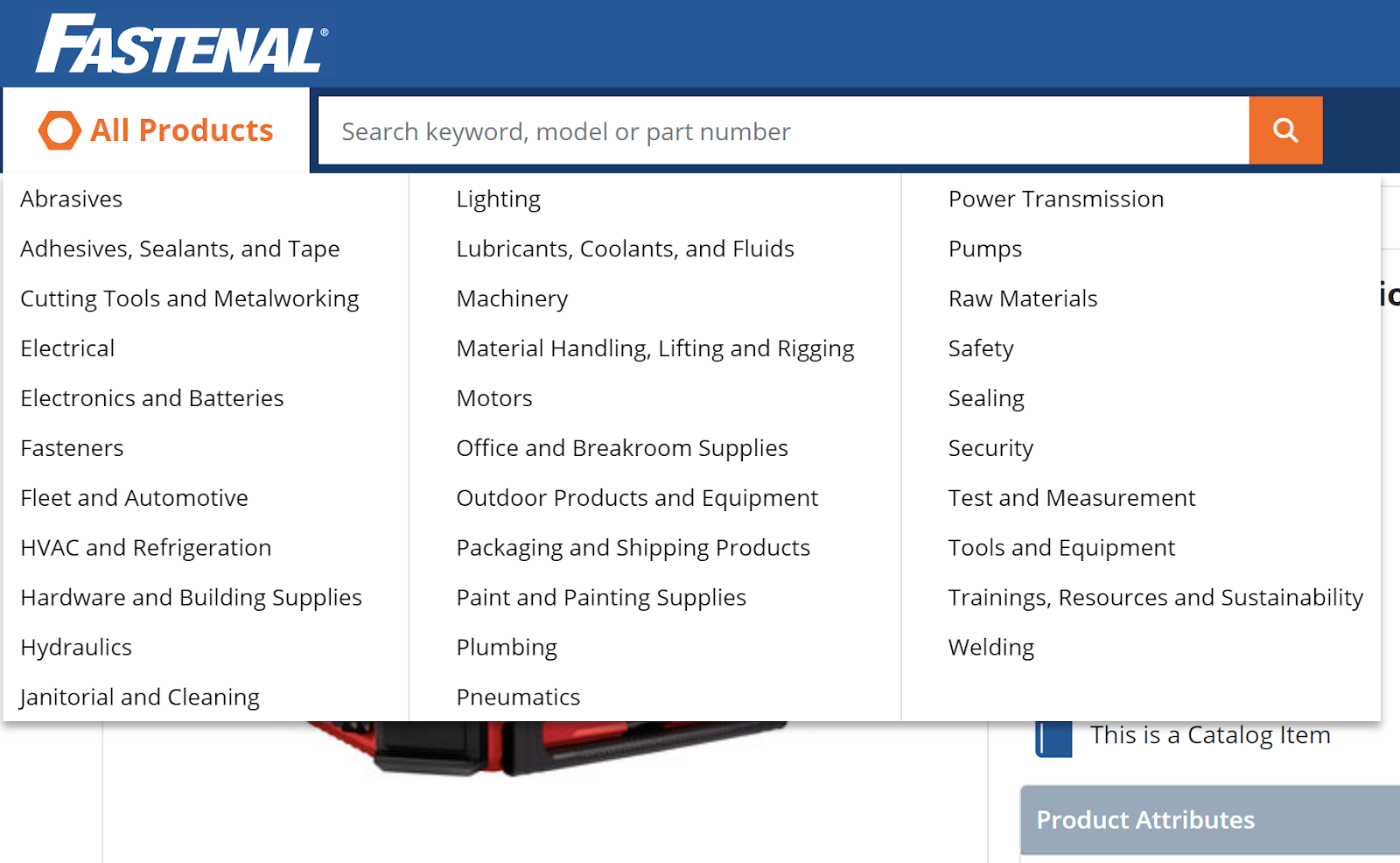
B2B buyers value websites that are easy to navigate, visually appealing, and intuitive to use. A well-designed UI/UX might include features like clear navigation menus, a clutter-free layout, and interactive elements that make the buying process straightforward.
Example: A B2B ecommerce site could use drop-down menus for easy category access, high-quality images to represent products, and interactive elements like zoom-in features or 360-degree views for better product inspection.
6. Responsive Web Design
Responsive web design is necessary for B2B ecommerce sites. Mobile-responsive design ensures the website is accessible and functional across device types, including desktops, tablets, and smartphones.
For B2B buyers, accessing the site seamlessly on any device, at the office, or on-the-go, enhances the user experience significantly. A responsive design adapts the layout to the viewing environment. It ensures content is readable and navigable regardless of screen size.
Example: For the customer’s convenience, a B2B website for construction materials might have a mobile-responsive design that allows contractors to place orders directly from the field.
7. Security-Focused
A focus on security is essential. Transactions on B2B ecommerce platforms often involve large sums of money and sensitive corporate information.
Strong security measures include robust encryption, secure payment gateways, and compliance with data protection regulations like GDPR. This focus on security protects the platform from data breaches and builds user trust.
Example: A B2B ecommerce platform for cybersecurity services should have SSL certificates for website security, secure payment methods, and secure account login options to protect buyer and company data.
8. Speed-Optimized
Want a quick way to keep your visitors engaged? Optimize your page speed.
The page speed of a B2B ecommerce website directly impacts user experience and, consequently, sales. Fast-loading pages help give potential buyers a smooth, uninterrupted browsing experience. That helps reduce bounce rates.
Example: B2B websites should optimize image sizes, utilize efficient coding practices, and leverage browser caching to improve loading times.
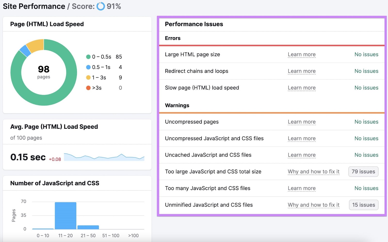
Use the Semrush Site Audit tool to check your page speed.
To get started, open the tool.
If it’s your first time using Site Audit, enter your domain. Then click “Start Audit.”

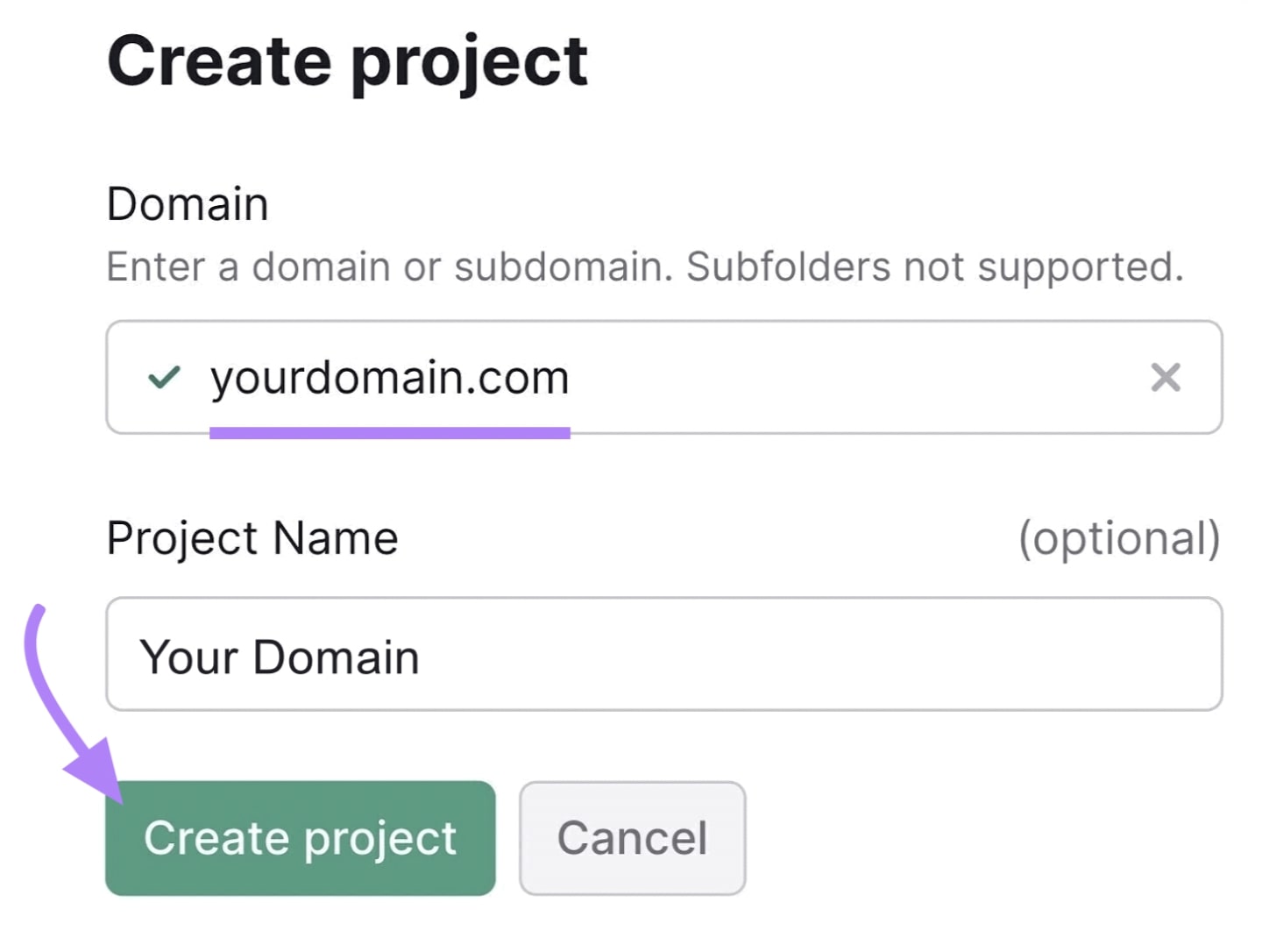
If you already have projects in Semrush, click the “+ Create project” button to start a new one in Site Audit.

Fill in your domain. Enter a project name if you want one. Then click “Create project.”
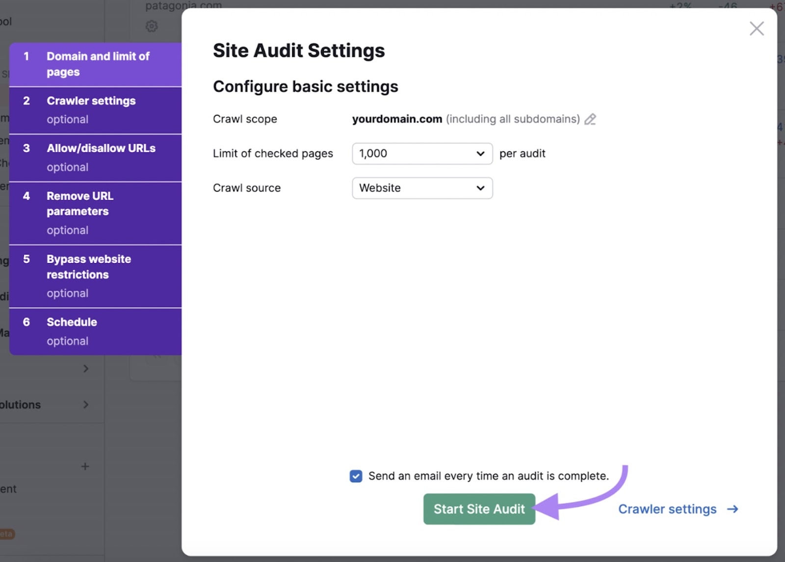
Follow the prompts in the “Site Audit Settings” window to set up your project. You can use the default settings. Or follow our detailed setup guide to customize the audit.
When all your desired settings are configured, click the “Start Site Audit” button.
Once the audit is complete, check your site speed by going to the “Overview” tab.
Look for “Thematic Reports.” Find “Site Performance,” then click “View details.”
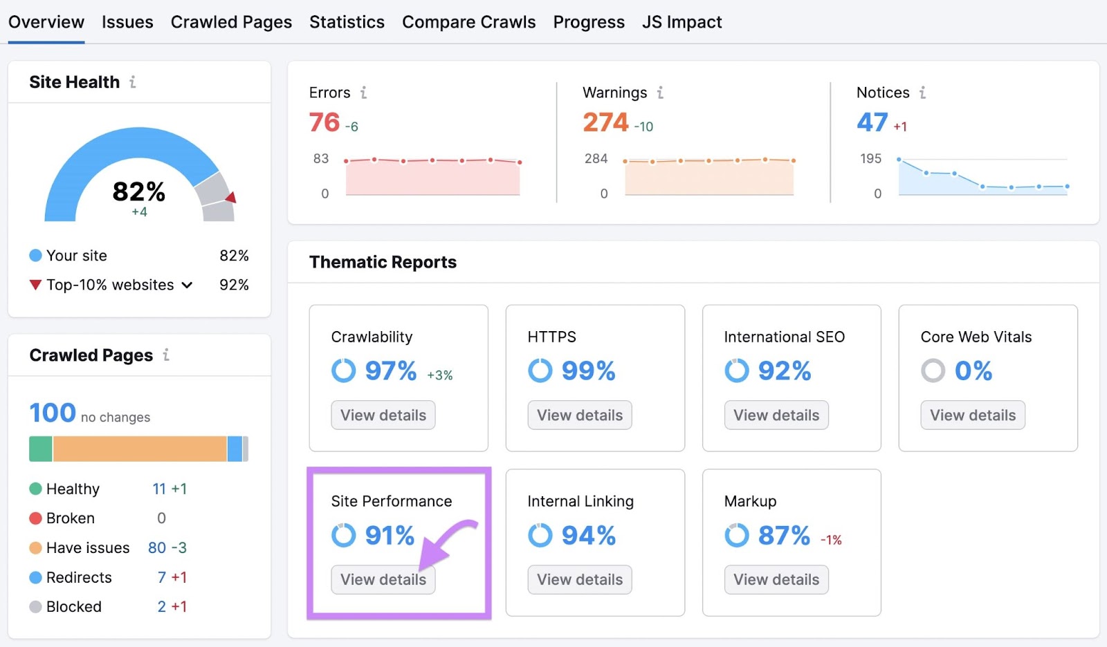
Use the “Site Performance” report to gain insights into your page speed. Work through the errors, warnings, and notices to improve your loading speed.
9. Detailed Site Search and Filtering
Similar to good catalog management, advanced search and filtering options help users find what they’re looking for more easily.
Ensuring your website has precise search and efficient filtering capabilities can make a big difference in whether or not a search becomes a sale. Especially in B2B ecommerce, where products can be numerous and varied. A user-friendly search feature improves the shopping experience and streamlines the purchasing process.
Example: A B2B ecommerce website offering office supplies might implement advanced search filters that allow users to search by product type, brand, price range, and other relevant parameters.
10. Great Technical SEO
Strong technical SEO is key to improving organic reach and attracting the right audience.
This involves optimizing the website for search engines through practices like:
- Submitting your sitemap to Google
- Properly using canonical tags
- Ensuring a clean, crawlable site structure
Example: A B2B website specializing in industrial HVAC services would ensure its pages are indexed correctly and rank well in search engine results. Technical SEO is crucial for driving organic traffic and reaching potential buyers effectively.
11. Reviews and Recommendations
B2B buyers often rely on peer opinions and case studies to inform their purchasing decisions.
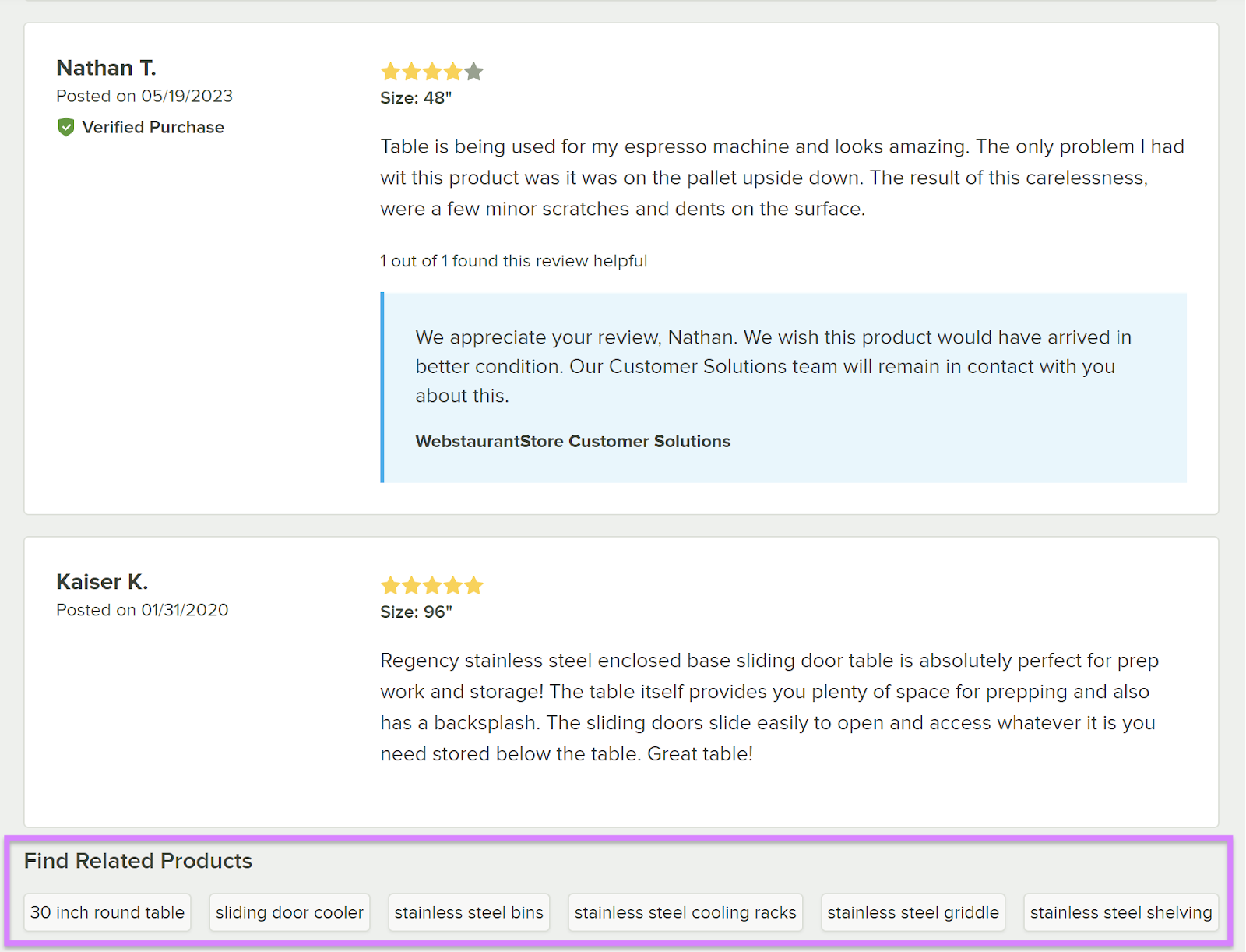
Incorporating customer reviews and recommendations on your ecommerce B2B website is especially vital for building trust and credibility. Reviews and testimonials help buyers make informed decisions based on real-world experiences.
Example: WebstaurantStore is a B2B site that specializes in restaurant supplies and equipment. They feature customer reviews and recommendations for related products.
12. Customizable Solutions
Customizable options are beneficial for B2B transactions. That’s because business buyers often have unique needs and varied preferences.
Offer flexible, customized solutions such as personalized product options or tailored service packages. This can be a good strategy with B2B customers since their lifetime value is usually much higher than in B2C.
A willingness to meet your customers' particular needs upfront showcases your company’s commitment to serving them well in the long run—which can pay off.
Example: A B2B website providing marketing services might allow businesses to customize their marketing package and select the services they need a la carte, based on their specific marketing goals and budgets.
13. Multi-Language Options
Given the global nature of many B2B businesses, B2B ecommerce websites can greatly benefit from offering multi-language options.
This feature caters to an international clientele by breaking language barriers and expanding market reach. It facilitates smoother transactions and better customer engagement across regions.
Multilingual SEO also helps with searchability and discovery from prospects in non-English speaking markets.
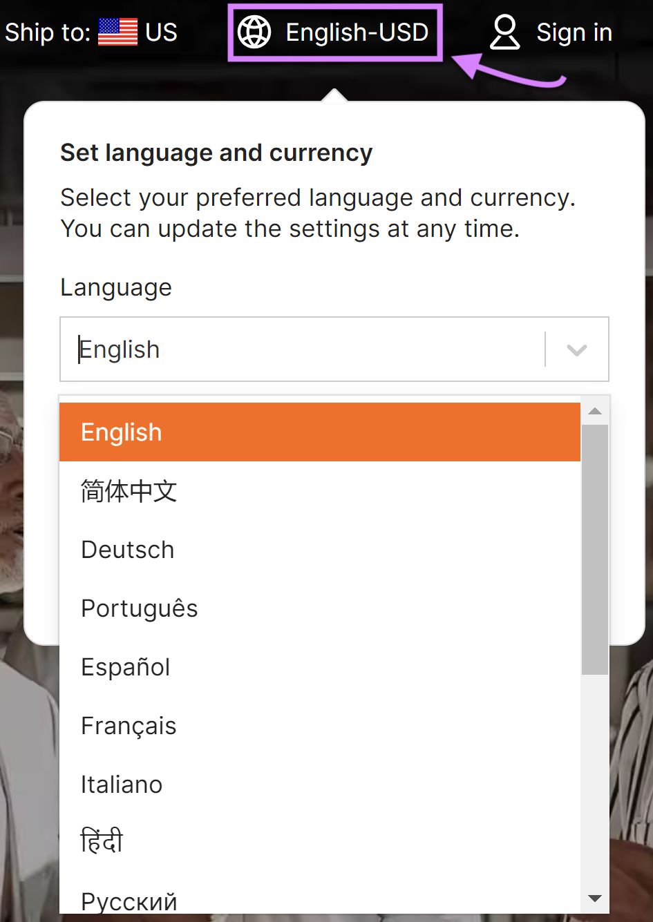
Example: A B2B ecommerce platform dealing in global trade could provide language options that target their core markets, such as Spanish, French, and Mandarin. Alibaba features an easy-to-navigate drop-down menu for language selection to accommodate users in their core markets.
14. Flexible Checkout Process and Delivery
If your website has checkout functionality, make sure it operates smoothly. This greatly enhances user experience and reduces cart abandonment.
Offer a variety of payment options, easy-to-follow checkout steps for the buyer, and flexible delivery choices. Streamlining these processes helps ensure buyer satisfaction with a hassle-free shopping experience.
Example: A B2B ecommerce site selling office furniture might provide options for different payment methods, including purchase orders. And they could offer flexible delivery scheduling to accommodate their clients' business operations.
15. Certified Ecommerce Trust Logos
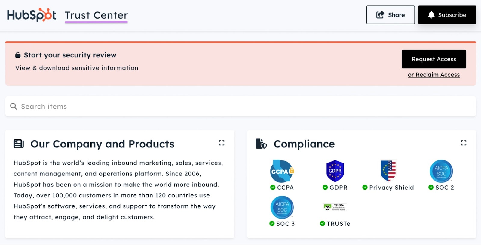
Displaying certified trust logos on your website demonstrates your credibility by assuring visitors of the site's legitimacy and security.
Trust logos like VeriSign or BBB Accredited Business can instill confidence in buyers. Particularly in a B2B context where transactions are typically larger and involve more risk.
Example: A B2B ecommerce company dealing in software solutions could have a Trust Center that displays SSL certificate logos and compliance badges on its website to reassure buyers of the site's security measures.
16. Customer Registration
Offering customer registration on a B2B ecommerce site allows for a more personalized shopping experience.
Registered users can benefit from features like order tracking, purchase history, and personalized product recommendations. Plus, you can also nudge buyers back to your website with features like abandoned cart reminders and future discounts.
Example: For a B2B ecommerce site specializing in medical equipment, registered users could receive updates on new equipment and special deals. They would also have access to their purchase history, which facilitates easy repeat orders.
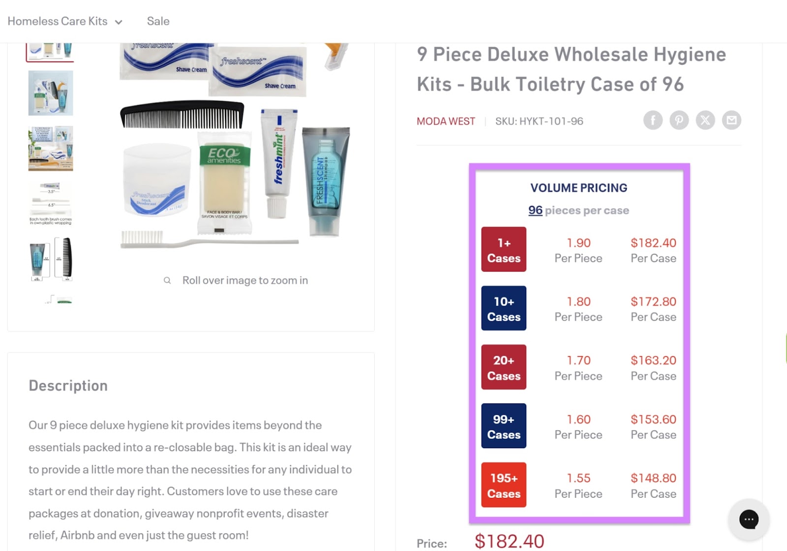
17. Multiple Pricing Options
B2B transactions often require flexible pricing structures since businesses have varied needs, budgets, and purchase volumes. Pricing options can include tiered pricing, volume discounts, and negotiated pricing.
Example: Backpack USA, a B2B website specializing in school supplies, has volume pricing options for many of their products with discounts applied when building in bulk.
Implementing these features and B2B ecommerce best practices will help take your site to the next level.
32 Top B2B Ecommerce Websites to Get Inspiration From
Here are 32 companies that show off some of the best B2B ecommerce website design.
1. ACME
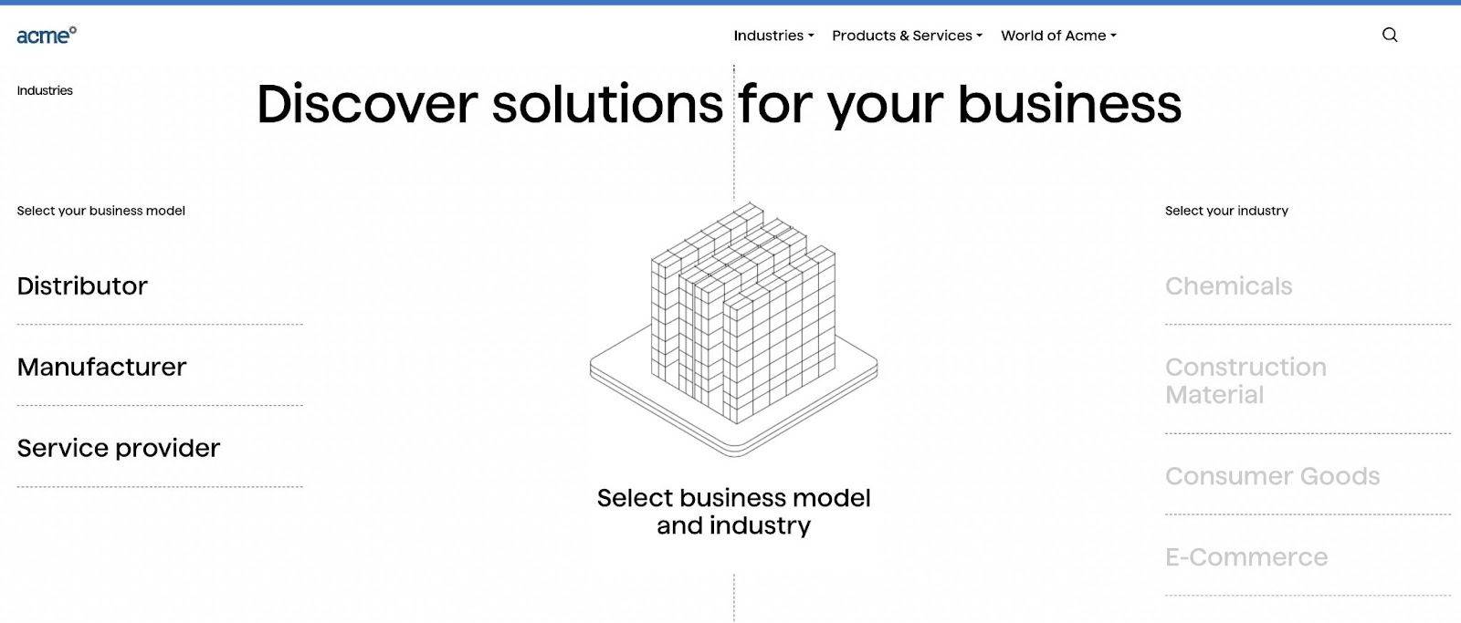
ACME is a packaging materials provider for logistics operators and shippers.
What It Does Right:
- Well-designed UI/UX: ACME’s website provides an enjoyable user experience that tells a cohesive story as you scroll
- Good catalog organization: A sleek interface with clearly outlined business models and industries helps visitors find the information most relevant to them
- High-quality content: Find quality, digestible information about ACME’s products and services as well as buyer guides, videos, and case studies
2. Alibaba Group
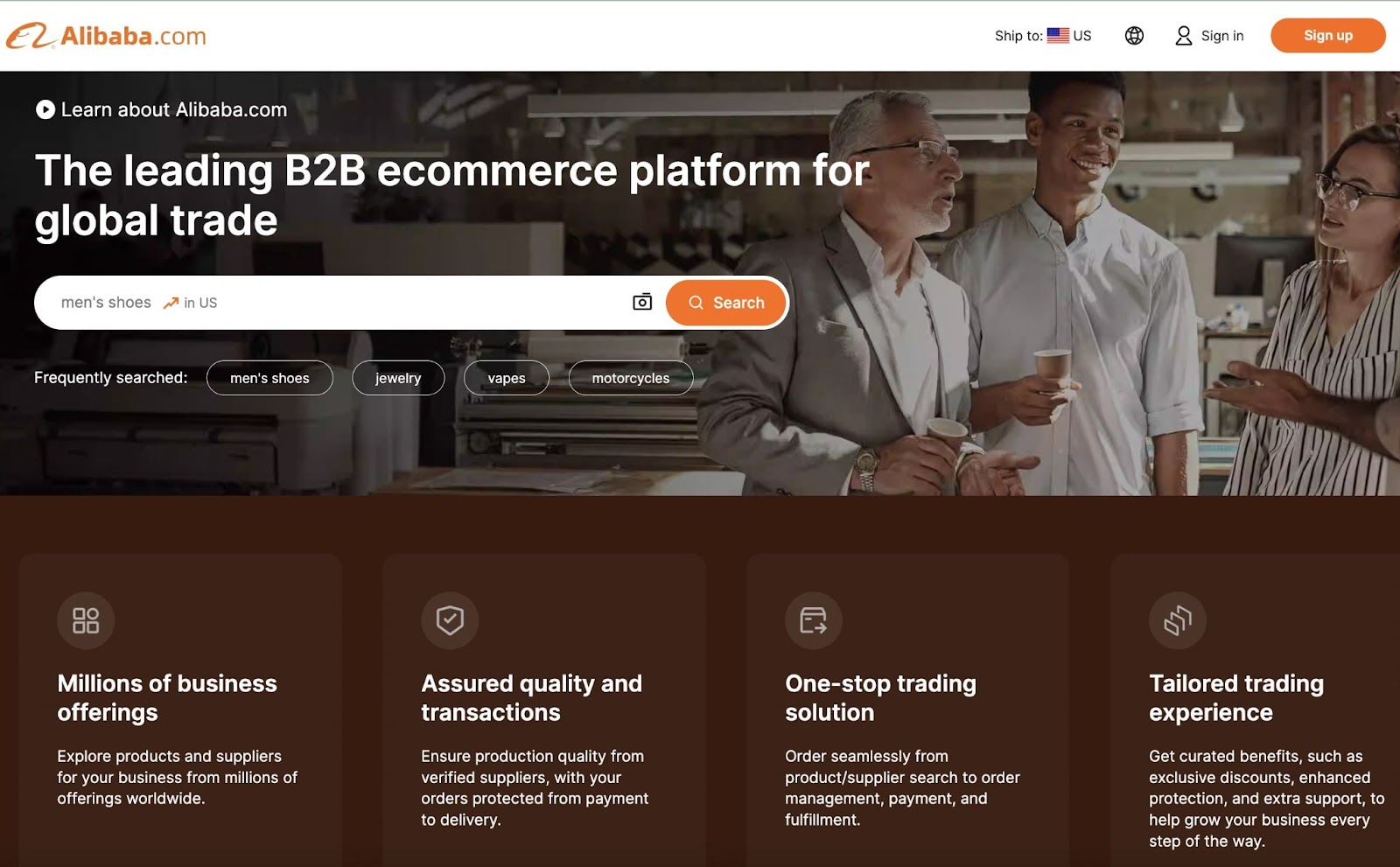
Alibaba, the world's largest B2B ecommerce brand, offers a user-friendly online shopping platform and a colossal selection across its B2B online marketplace.
Their website design focuses on serving a substantial global customer base efficiently.
What It Does Right:
- Good catalog organization: Alibaba.com features a simple, clear product catalog
- Multi-language options: They provide multilingual navigational experiences and support
- Customizable solutions: Functionality lets visitors get in contact with suppliers and find customizable product bundles
- CTAs: CTAs are clear and value propositions are unique
3. Amazon Business
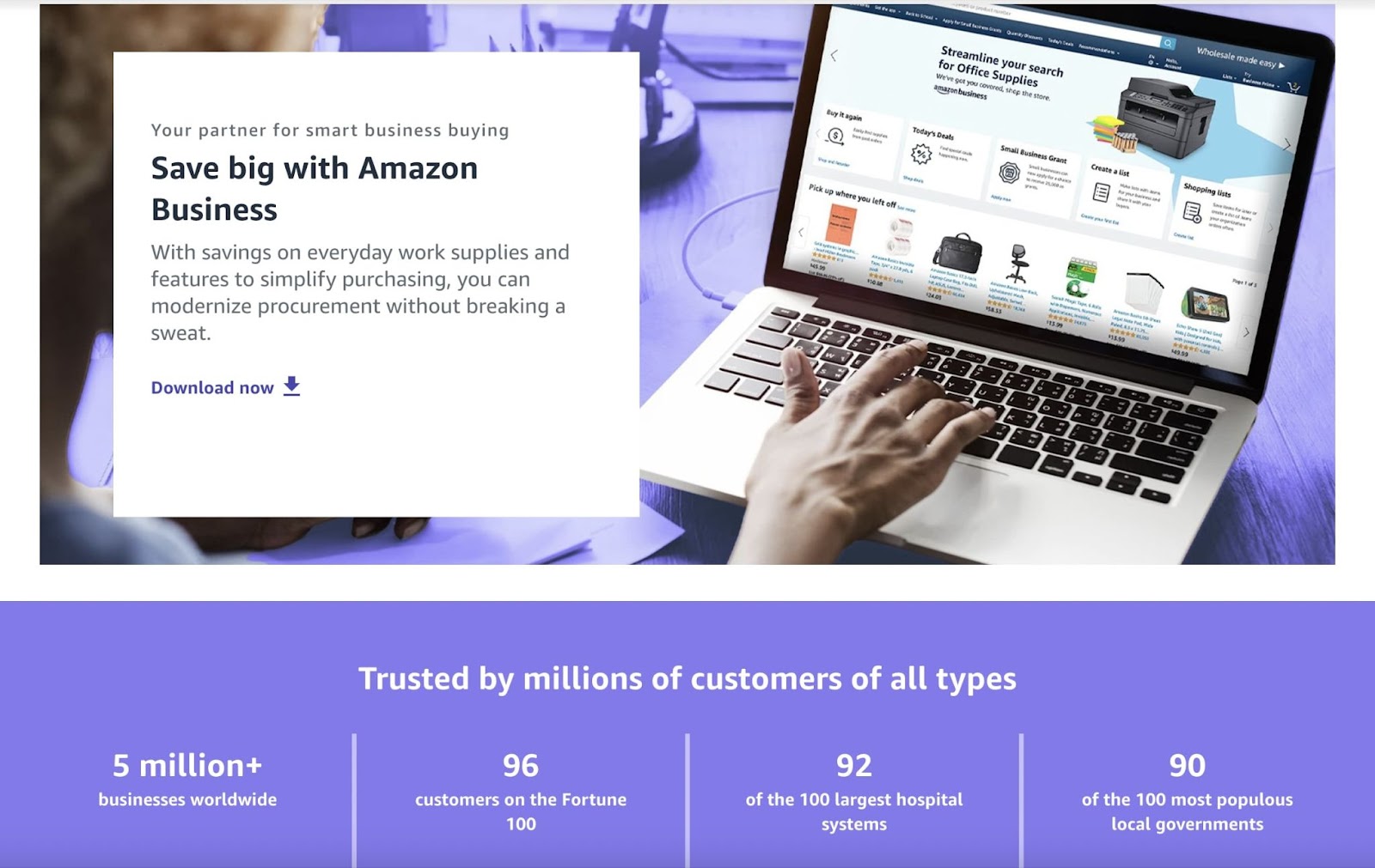
Amazon's ecommerce B2B website mirrors its B2C success by offering a broad product range while enhancing the buying experience for business clients.
What It Does Right:
- Well-designed UI/UX and detailed site search and filtering: Amazon offers user-friendly navigation that prioritizes searchability and ease
- Responsive web design and speed-optimized: Amazon understands their buyers visit from a variety of devices and platforms, and serves up responsive designs swiftly
- Customer registration: A beneficial logged-in experience comes with features like saved shopping carts, multi-user accounts, and customer chat
- Flexible checkout process and delivery: Includes multiple payment options, simple invoicing, and easy returns
4. Avery Dennison
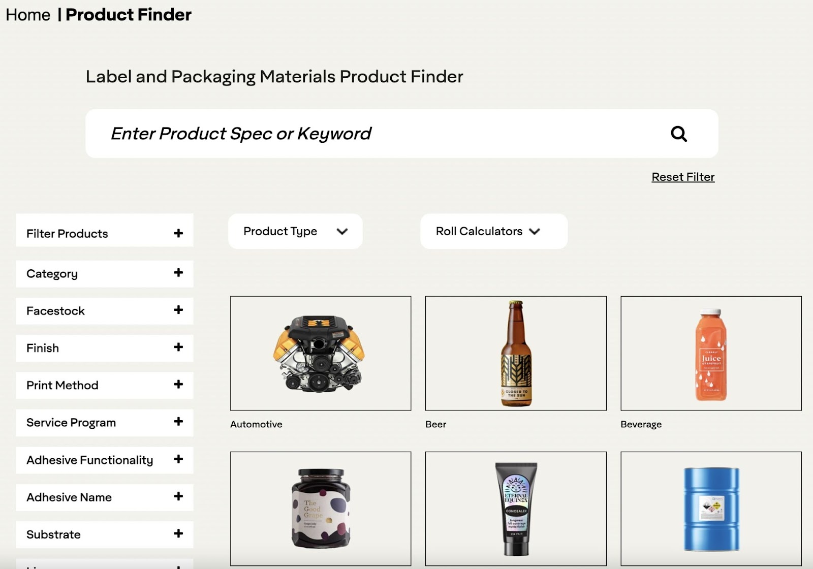
Avery Dennison specializes in labeling and packaging materials.
What It Does Right:
- Good catalog organization and comprehensive product descriptions: Product and solution categories are clearly outlines, and detailed information is provided
- Well-designed UI/UX: The website features a clean, intuitive user interface
- Detailed site search and filtering: Faceted search, “Product Finder,” helps visitors find exactly the right kind of label or packaging material to meet their needs
What Platform It's Built On:
- BigCommerce
- Adobe Experience Manager (CMS)
5. Berlin Packaging
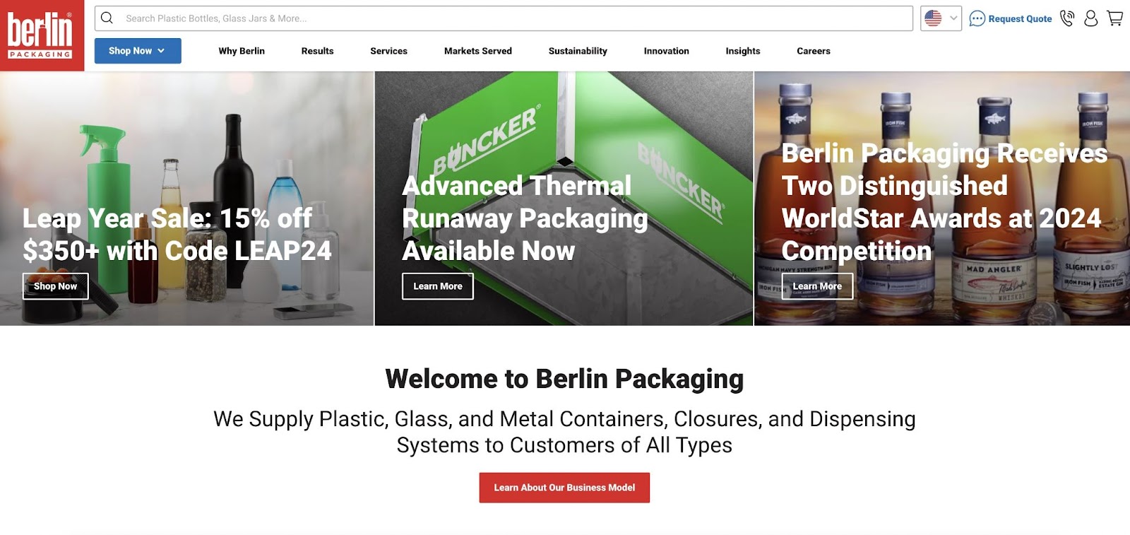
The Berlin Packaging website provides an expansive ecommerce store with a wide selection of packaging items and services.
What It Does Right:
- Good catalog organization: Catalog organization is excellent and includes an easy-to-use drop-down menu
- Responsive web design: A seamless shopping experience offers interactive functionality no matter your device
- Detailed site search and filtering: User-friendly navigation includes multifaceted search
- Customizable solutions: Personalized quotes and convenient quantities for direct purchase are both available
What Platform It's Built On:
- BigCommerce
6. Blackbaud
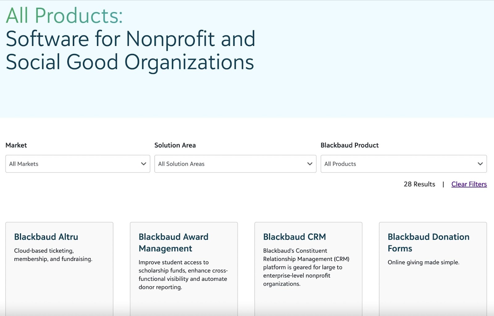
Blackbaud caters to non-profit and educational sectors with specialized software solutions.
What It Does Right:
- High-quality content: Content is tailored for nonprofits and includes infographics and case studies plus interactive offerings like quizzes, surveys, and calculators
- Reviews and recommendations: There’s a comprehensive Customer Stories section with filtering functionality
What Platform It's Built On:
- Wordpress
7. Blake Envelopes
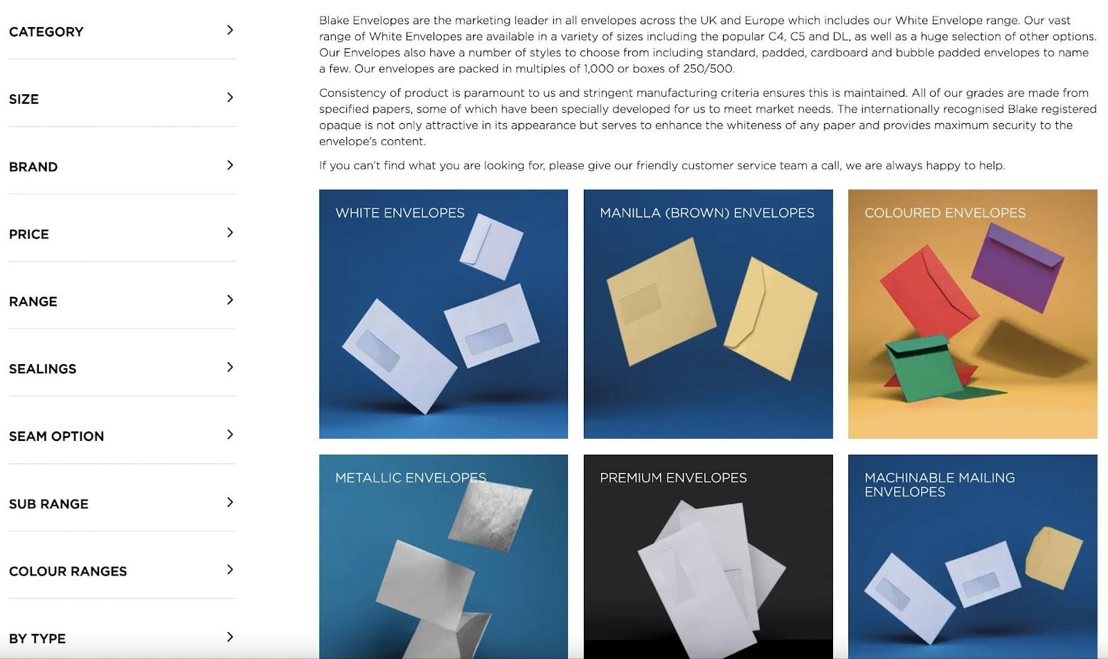
Who says a paper-based company can’t have a great website? Blake Envelopes is an envelope, paper, and packaging company based in Ontario, Canada.
What It Does Right:
- Well-designed UI/UX: Offers a simple, clean design focusing on user experience and easy navigation
- Detailed site search and filtering: A clear, varied, and thorough set of filtering options helps customers find exactly what they need
What Platform It's Built On:
- Adobe Commerce (formerly Magento)
- HubSpot
8. Bulk Bookstore
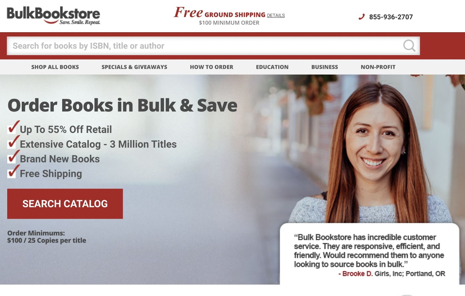
Bulk Bookstore is a niche B2B ecommerce site with a huge range of books with bulk-pricing options.
What It Does Right:
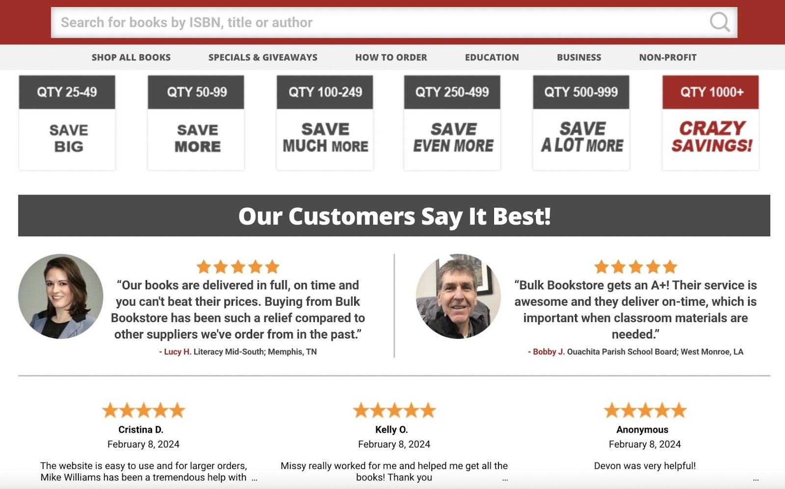
- Flexible checkout process and delivery: Offers efficient ordering, free shipping, and timely delivery. The site also takes a variety of payment options—including purchase orders, credit cards, PayPal, checks, and wire.
- Reviews and recommendations: Front and center on the homepage, they feature reviews from happy customers
What Platform It's Built On:
- BigCommerce
9. Chocomize
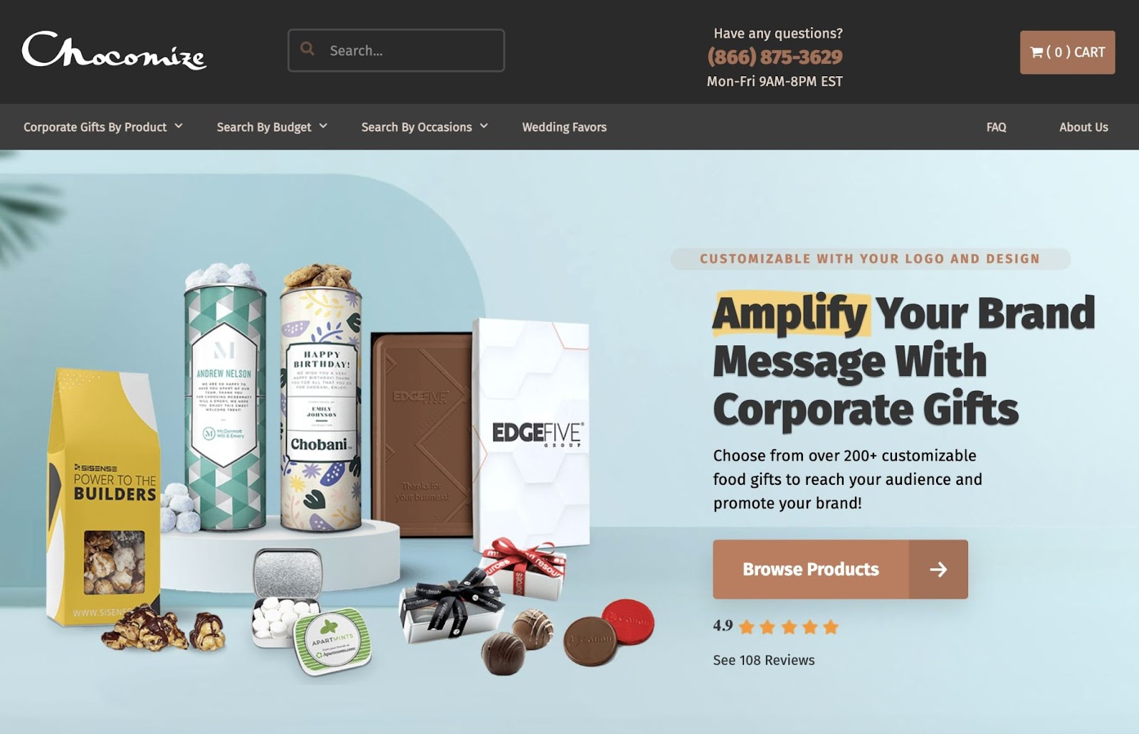
Chocomize offers customizable chocolate products with a unique business model and user-friendly website.
What It Does Right:
- Speed-optimized and great technical SEO: Fast-loading times help maintain visitor interest and improve search engine rankings. The website also touts solid on-page SEO strategies like hierarchical content, keyword optimization, and alt image tags.
- Security-focused: They showcase their focus on security by including certified ecommerce trust logos and reassuring clients of a safe shopping experience
- Good catalog organization: They feature a straightforward way to use the main menu and search their products by type, budget, or occasion
What Platform It's Built On:
- Adobe Commerce (formerly Magento)
10. Curbell Plastics
Curbell Plastics differentiates itself as a leader in plastic product distribution.
What It Does Right:
- Comprehensive product descriptions: The website emphasizes detailed product information
- Responsive web design: Provides user-friendly performance on desktop and mobile
- Well-designed UI/UX and detailed site search: The site incorporates intuitive user navigation with shapes that help with product discovery
- Multiple pricing options: No minimums are required, and volume discounts cater to customers of all sizes
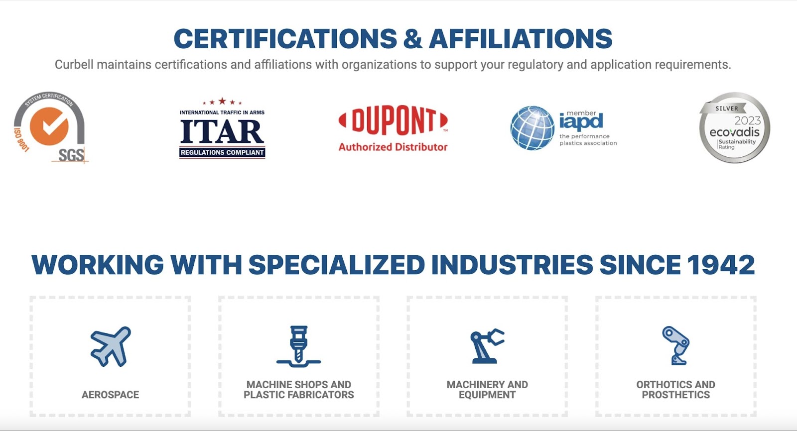
- Certified ecommerce trust logos: Trust logos reassure customers of the company’s commitments to regulatory requirements
What Platform It's Built On:
- WooCommerce
- HubSpot
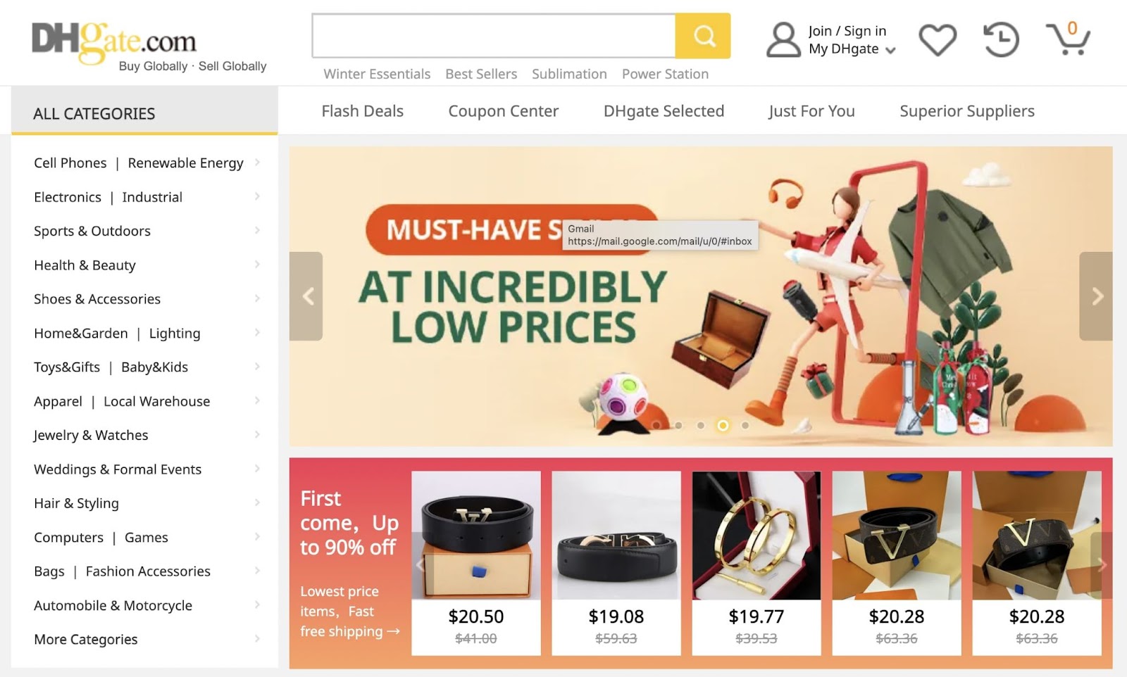
11. Dhgate
DHgate offers a comprehensive marketplace connecting international buyers, especially small- and medium-sized businesses, with wholesale suppliers.
What It Does Right:
- Multi-language options: Catering to its global audience, the site uses Google Translate functionality to offer multi-language options, enhancing accessibility and user experience for international clients
- Detailed site search and filtering: Advanced search and filtering capabilities allow buyers to navigate through the vast product catalog easily
What Platform It's Built On:
- My Salesforce
12. Ferguson
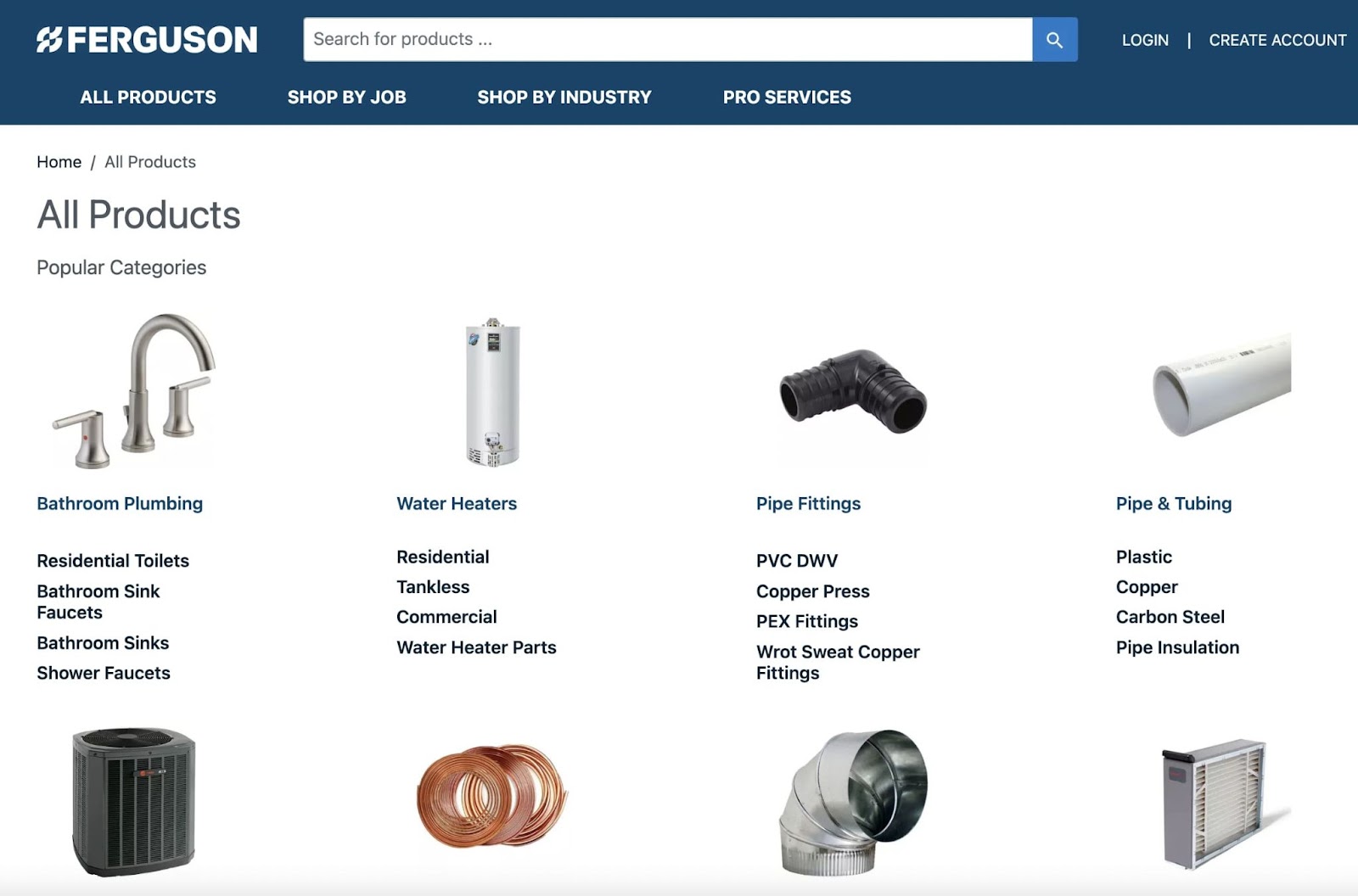
Ferguson is a B2B and B2C company that sells plumbing supplies, HVAC products, and building supplies to professional contractors and homeowners.
What It Does Right:
- Well-designed UI/UX: The website boasts a clean and user-friendly design, facilitating easy navigation through its sizable array of categories
- High-quality content: Ferguson invests in their content marketing, offering content that informs and educates their diverse clientele, addressing the specific needs of both B2B and B2C customers
What Platform It's Built On:
- My Salesforce
13. Firerock
Firerock specializes in high-quality building materials for custom home builds.
What It Does Right:
- High-quality content: Firerock excels in delivering high-quality content and beautiful photos that help customers envision their use cases. This is essential for informed B2B purchasing decisions in the building materials sector.
- Comprehensive product descriptions: Detailed product descriptions are a highlight, providing valuable information to B2B clients about their range of building materials
- Well-designed UI/UX: The platform offers a user-friendly interface, enhancing the overall sales experience for clients
What Platform It's Built On:
- Wordpress

14. General Electric (GE)
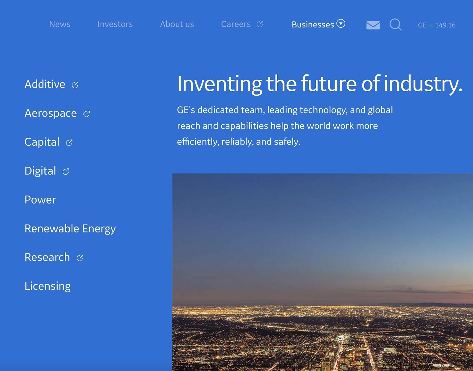
GE offers a variety of innovative technological products across industries like aerospace, power, and renewable energies.
What It Does Right:
- Detailed site search and filtering: GE's platform offers refined search and filtering, helping customers navigate their extensive product range
- Comprehensive product descriptions: Each product is accompanied by detailed information, catering to the intricate needs of B2B buyers in the tech sector
- Responsive web design: GE’s website design is responsive, providing an optimal user experience across various devices and platforms
What Platform It's Built On:
- Drupal
- Atlassian Cloud
15. Global Sources
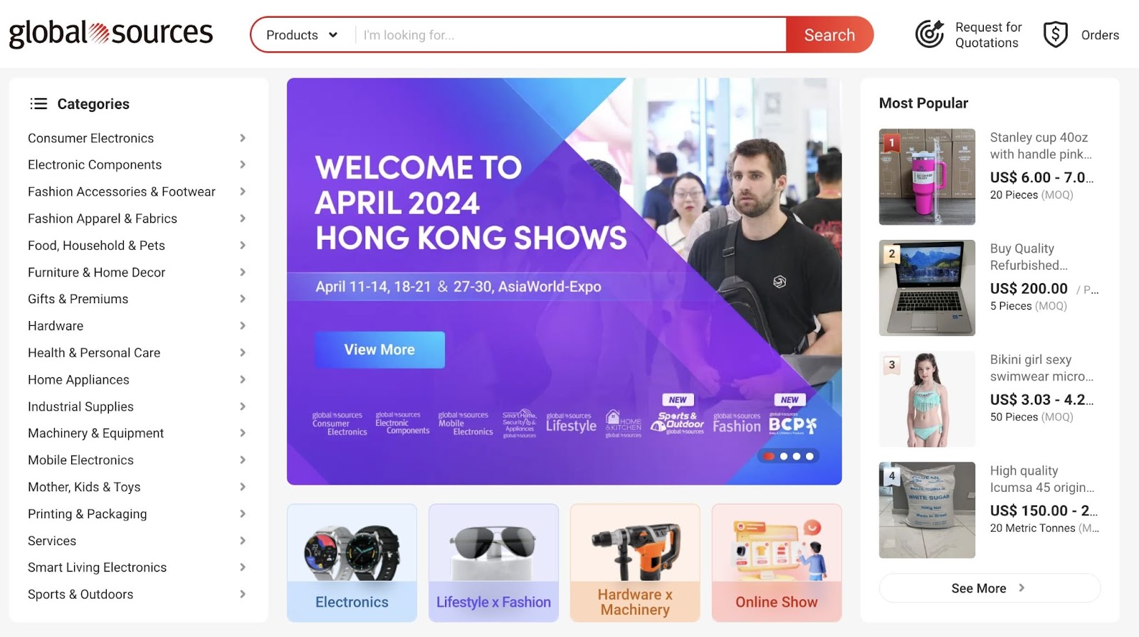
Global Sources is a top choice for international trade, connecting B2B buyers and sellers worldwide with a huge variety of products.
What It Does Right:
- High-quality content: Global Sources emphasizes high-quality content to facilitate informed decision-making in international trading
- Well-designed UI/UX: The platform is designed for easy navigation, enhancing global sourcing for B2B buyers and sellers
16. Grainger
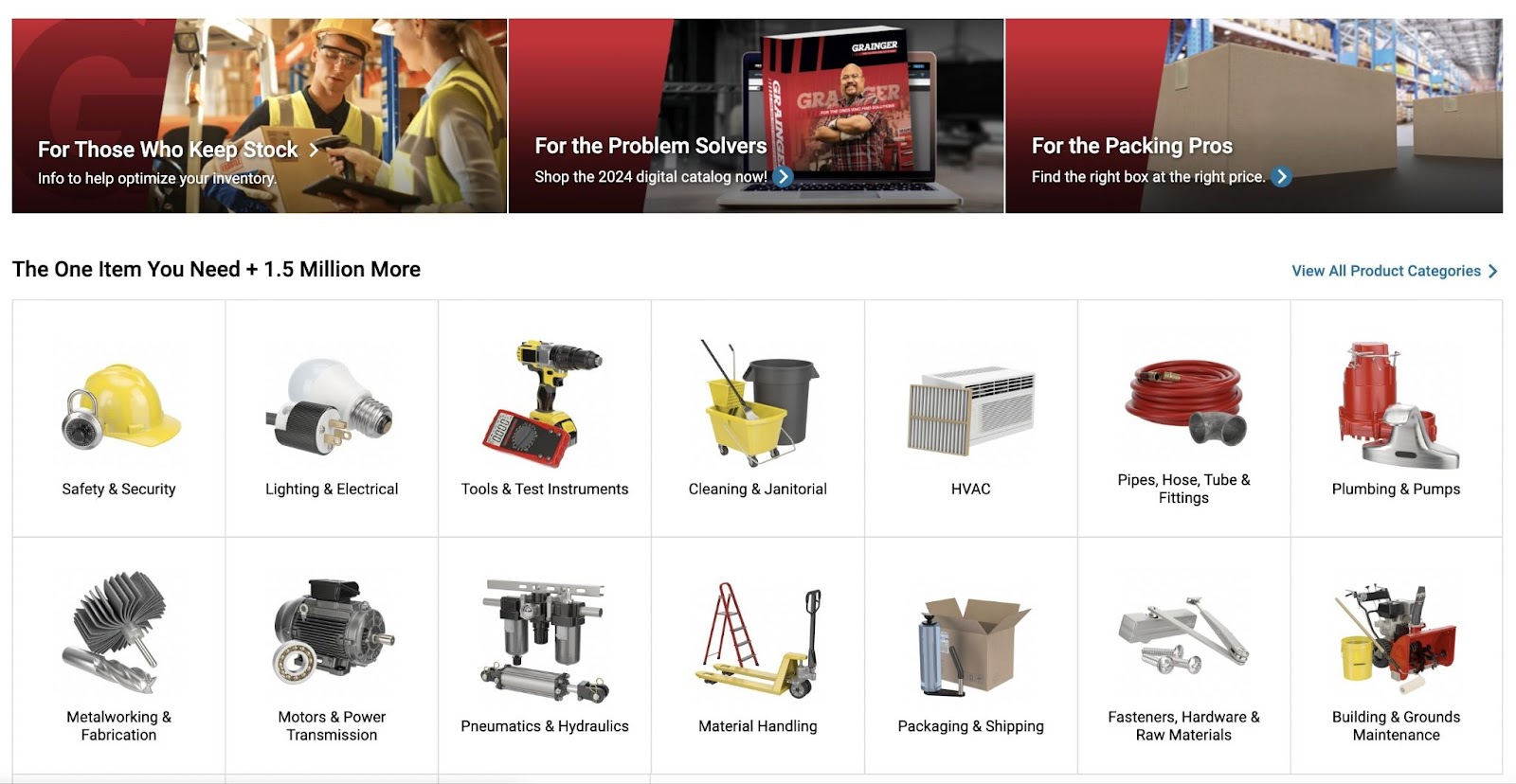
Grainger offers various industrial supplies for businesses in industries such as healthcare, manufacturing, public sector, and more.
What It Does Right:
- Speed-optimized: The website is optimized for quick loading, all the more important for a fast-paced B2B environment
- Comprehensive product descriptions: Each product comes with a thorough description, aiding industrial buyers' decision-making
- Good catalog organization: Clear images represent the various product categories and are outlined in a grid
What Platform It's Built On:
- My Salesforce
- Unbounce
17. Indiamart
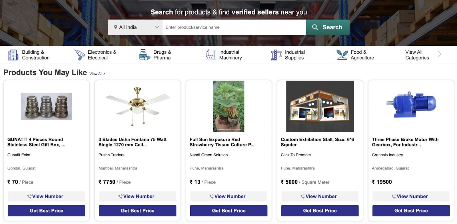
Indiamart is a leading B2B marketplace offering a wide range of products and services. They cater primarily to the Indian market.
What It Does Right:
- Customizable solutions: Indiamart tailors its offerings to diverse needs, providing flexibility for various business requirements
- Detailed site search and filtering: The platform’s advanced search and filtering options facilitate easy product discovery for a range of services and products
- Responsive web design: There’s a responsive and seamless experience across different devices
18. Made-in-China
Made-in-China provides a broad range of products manufactured in China. They cater to global B2B businesses.
What It Does Right:
- Well-designed UI/UX: The platform offers user-friendly navigation which simplifies the process of sourcing products from China
- Good catalog organization: The website offers a well-organized, broad range of Chinese-manufactured products
- Detailed site search and filtering: Advanced search and filtering options enable efficient product discovery and selection for international buyers

19. Magnetica
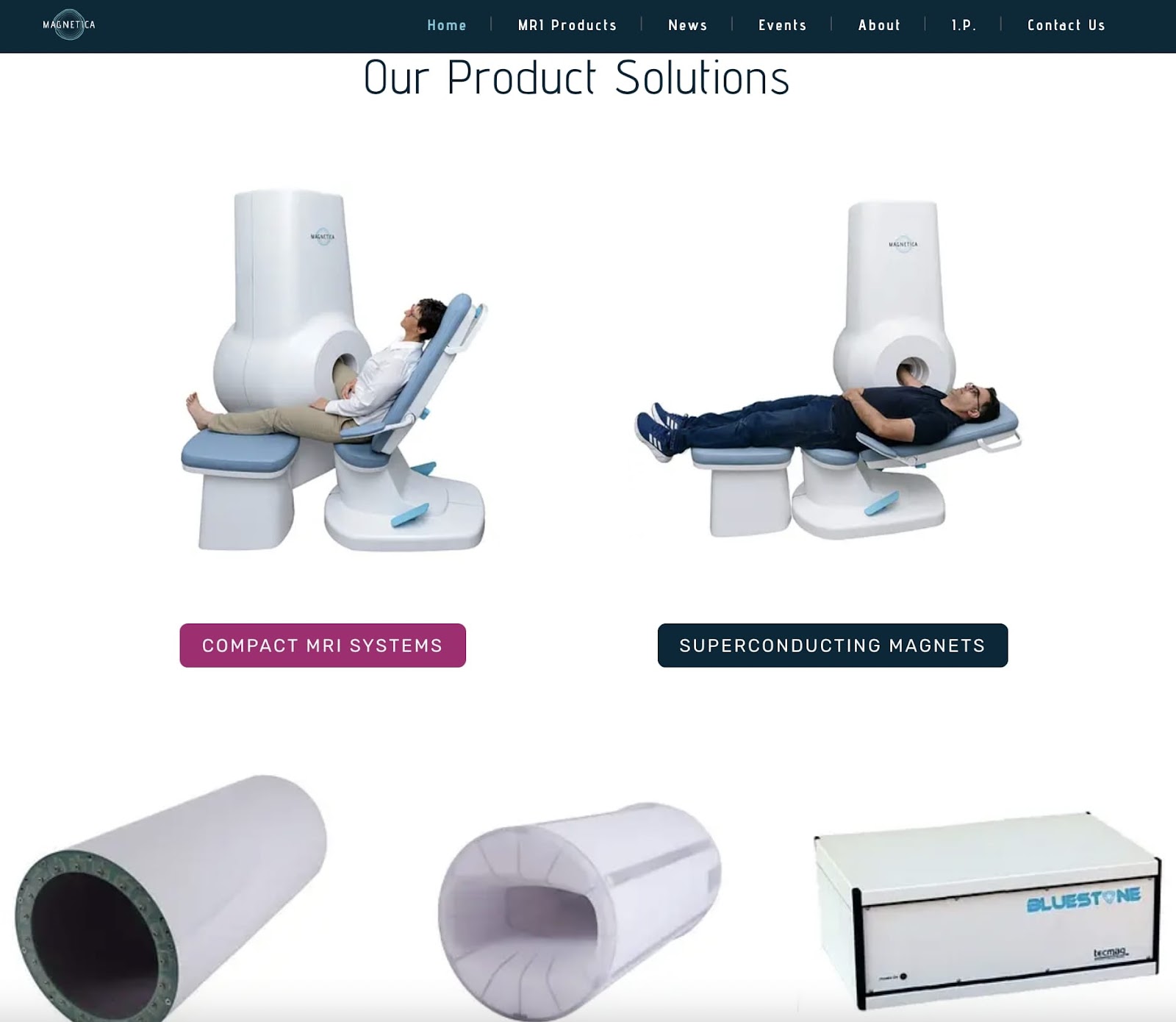
Magnetica is an Australian-based global MRI system original equipment manufacturer. They sell magnetic and electromagnetic products tailored to specialized B2B buyers.
What It Does Right:
- High-quality content: The platform is enriched with high-quality content, offering valuable insights and information to its clients
- Responsive web design: Their website's responsive design ensures a consistent and efficient browsing experience, regardless of the device type used
What Platform It's Built On:
- WordPress
20. Massey Ferguson
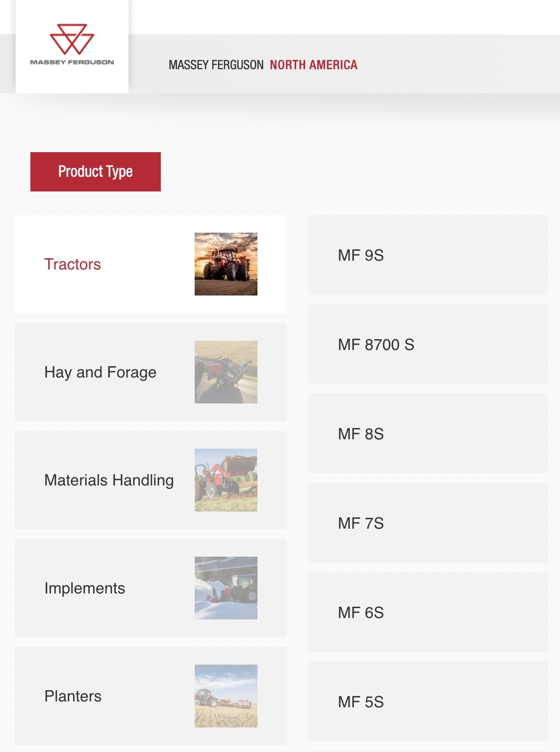
Massey Ferguson is a leader in selling agricultural machinery and farming technology.
What It Does Right:
- Comprehensive product information: Massey Ferguson combines detailed product information with a focus on attentive customer service
- High-quality content: The platform provides high-quality content, crucial for clients in the agricultural machinery sector to make informed decisions
- Well-designed UI/UX: The design of their website offers a user-friendly interface, which makes it easy for customers to access the extensive range of agricultural products
What Platform It's Built On:
- Adobe Experience Manager
21. Medline
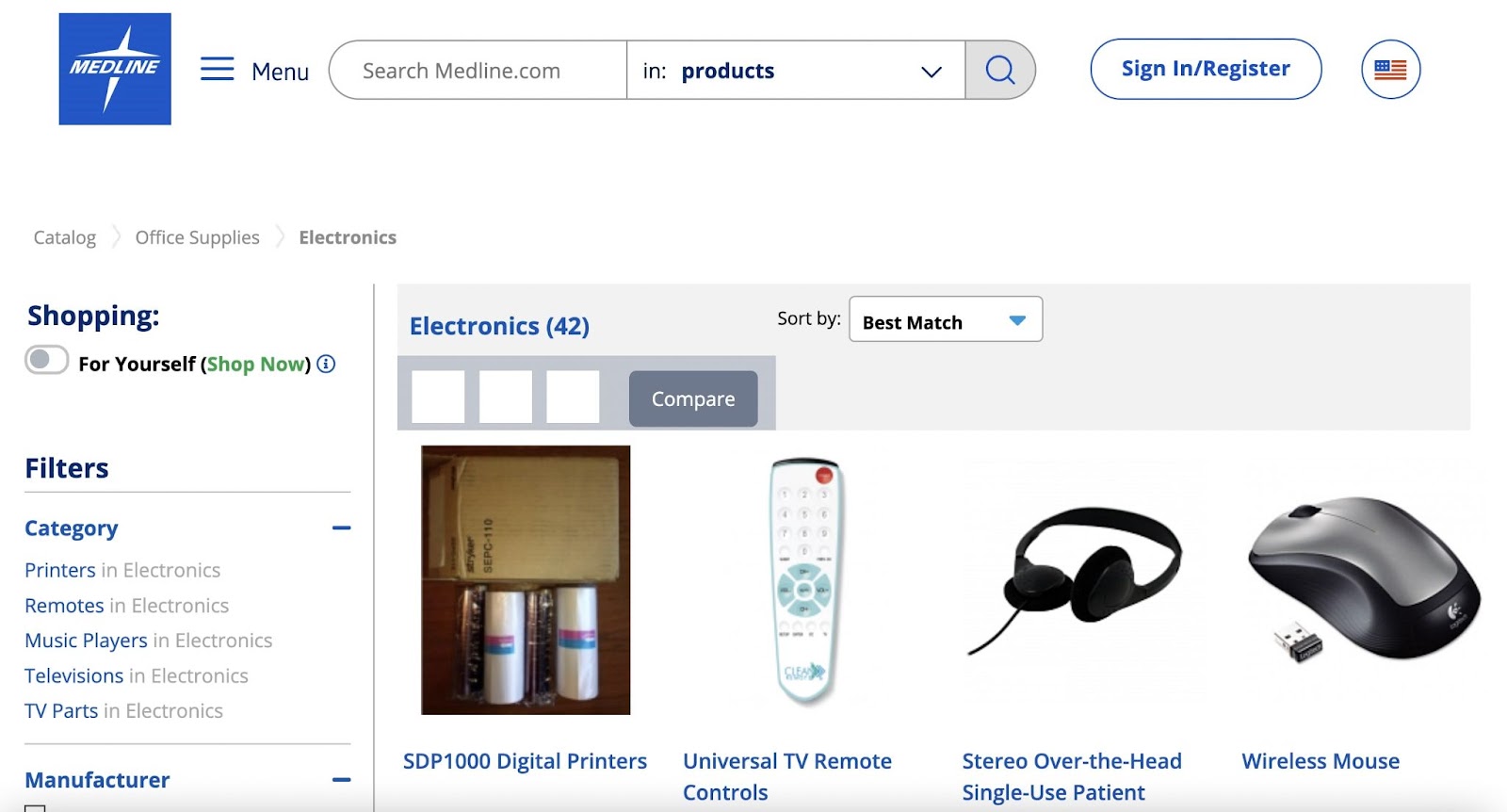
Medline is one of the largest private manufacturers and distributors of medical supplies for healthcare businesses.
What It Does Right:
- Detailed site search and filtering: Medline offers an impressive range of over 350,000 products, all easily discoverable through their sophisticated search and filtering capabilities
- Customizable solutions: The website provides a personalized view, allowing customers to tailor their browsing experience to their specific medical supply needs
- CTAs: Medline's site includes CTAs and interactive features that make it easy to find precise product information
- Customer registration: A logged-in experience lets visitors easily track order history
What Platform It's Built On:
- Wordpress
- WooCommerce
22. Mercateo
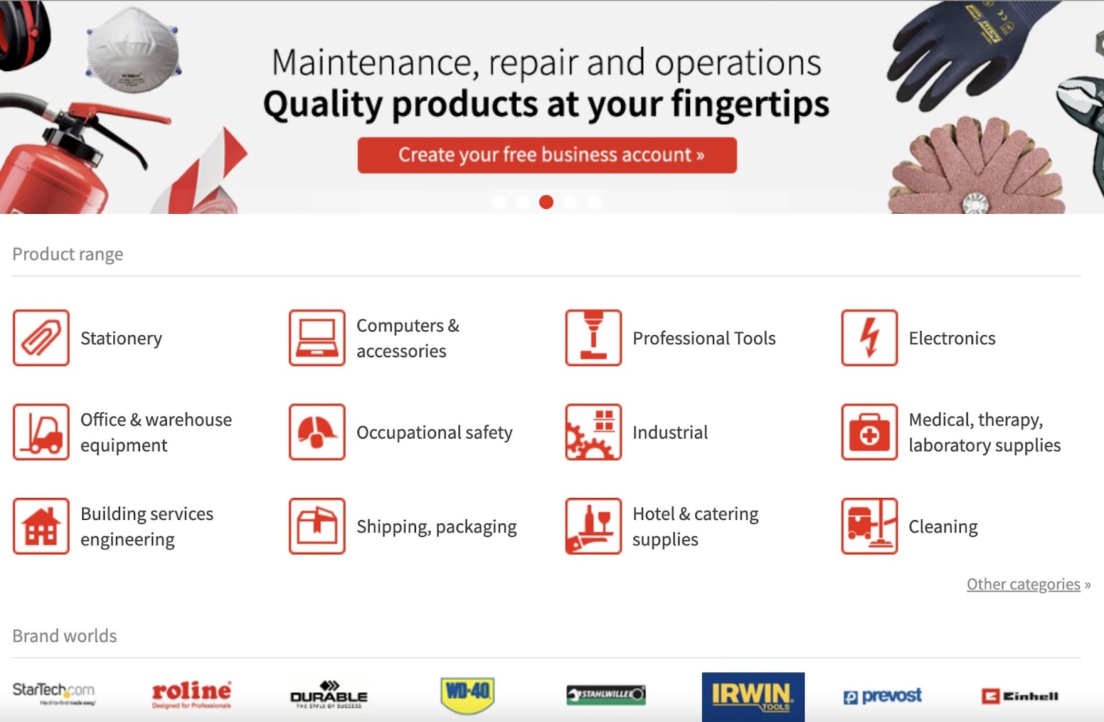
Mercateo is a European-based B2B ecommerce platform that offers a wide range of business products.
What It Does Right:
- Well-designed UI/UX: Mercateo's platform is intuitively designed, making it easy for business clients to find what they need efficiently
- Detailed site search and filtering: The site includes advanced search tools and filtering options, which allows users to quickly locate specific products within its enormous catalog
- Responsive web design: A seamless browsing experience is ensured across devices
- Multi-language options: Mercateo has different versions of their website for each market in local languages, such as German, Dutch, Italian, French, Spanish, Polish, and Hungarian
23. Msc Direct
MSC Direct is a leading provider of industrial tools and supplies. They’re known for their extensive product range.
What It Does Right:
- Good catalog organization: MSC Direct's online catalog is meticulously organized, enabling customers to easily browse through a broad selection of industrial tools and supplies
- Comprehensive product descriptions: Each product on the MSC Direct website features a in-depth description that provides valuable information to help customers make informed decisions
- Speed-optimized: The website is optimized for fast loading times, enhancing the overall user experience and efficiency in product search and selection
What Platform It's Built On:
- HCL Commerce
- My Salesforce
24. OverDrive
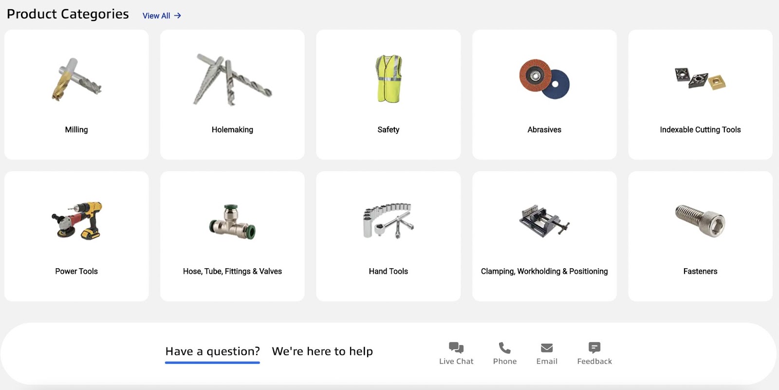
OverDrive is a globally renowned provider of audiobooks and ebooks, excelling in serving schools, retailers, publishers, and libraries with its digital content.
What It Does Right:
- Good catalog organization: OverDrive boasts one of the largest catalogs of digital content, well organized for easy navigation and accessibility by its global users
- Comprehensive product descriptions: Each audiobook and ebook has a thorough description that provides valuable insights and details to users
- Detailed site search and filtering: The focus on a straightforward and fully responsive site search feature, coupled with effective filtering options, makes finding specific titles quick and effortless
What Platform It's Built On:
- WordPress
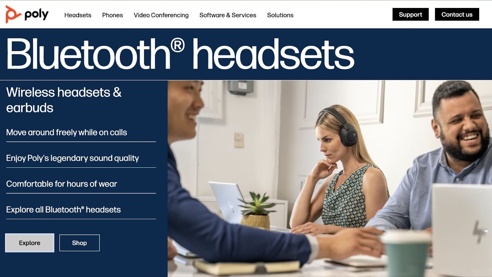
25. Poly
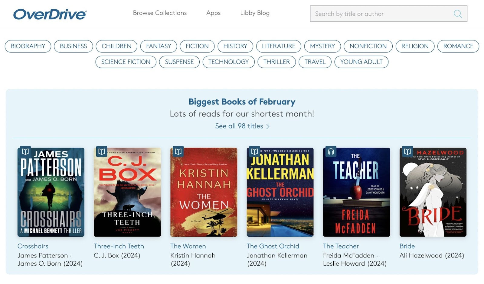
Poly (formerly Polycom) is a B2B arm of the HP company that provides communication technology—such as video, voice, and content solutions—for team collaboration.
What It Does Right:
- High-quality content and comprehensive product descriptions: Poly's focus on educational content that meets their audience's specific needs is evident in their marketing assets and detailed product descriptions
- Well-designed UI/UX and good catalog organization: Centered on customer needs, the website's user interface is intuitively designed. It allows visitors to browse the catalogs of products and solutions by platform, industry, workspace, and workstyle.
What Platform It's Built On:
- Amazon Web Services (AWS)
- Adobe Experience Manager
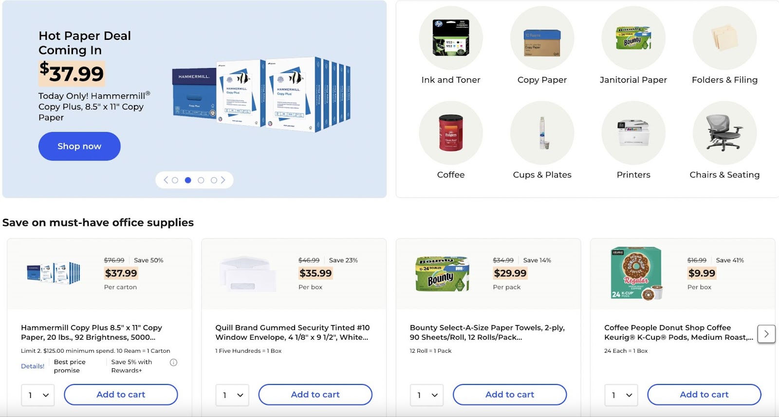
26. Quill
Quill is a leading provider of office supplies, known for its wide range of products suitable for office needs.
What It Does Right:
- Well-designed UI/UX: Quill's website offers easy navigation that allows customers to find and order office supplies effortlessly
- Comprehensive product descriptions: Each product on Quill's site comes with a thorough description, ensuring customers have all the information they need
- Flexible checkout process and delivery: The website includes features like order tracking and bulk ordering options, which adds convenience to the purchasing process
What Platform It's Built On:
- Powerfront
- My Salesforce
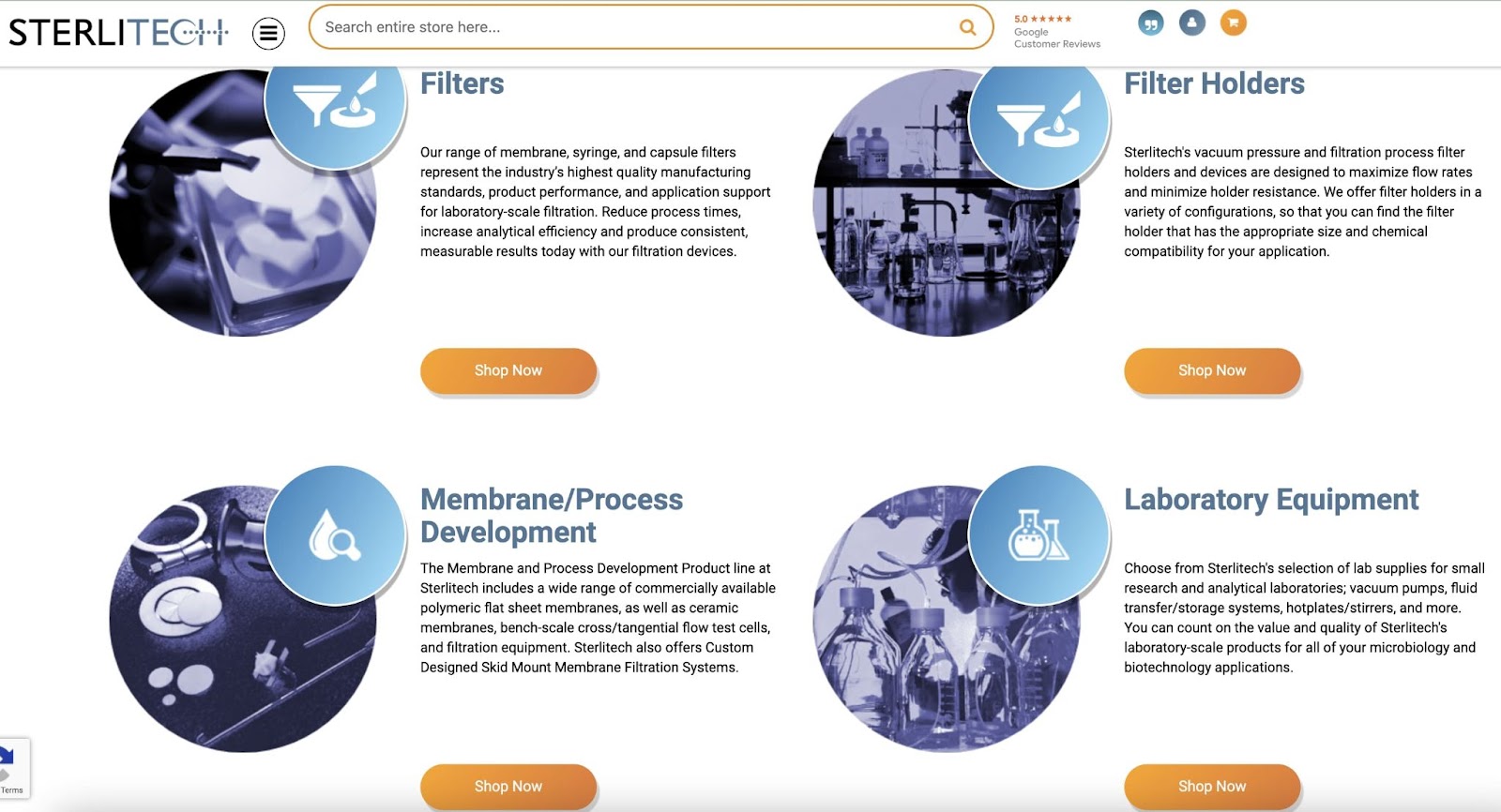
27. Sterlitech
Sterlitech specializes in providing laboratory and filtration products that focus on technical precision.
What It Does Right:
- Comprehensive product descriptions: The site showcases its technical product range with detailed descriptions and user guides
- High-quality content: Sterlitech enhances its product pages with valuable content that aids customers in making informed decisions
- Well-designed UI/UX: The platform is designed for ease of use, enabling customers to navigate through complex product categories seamlessly
What Platform It's Built On:
- Adobe Commerce (formerly Magento)
- My Salesforce
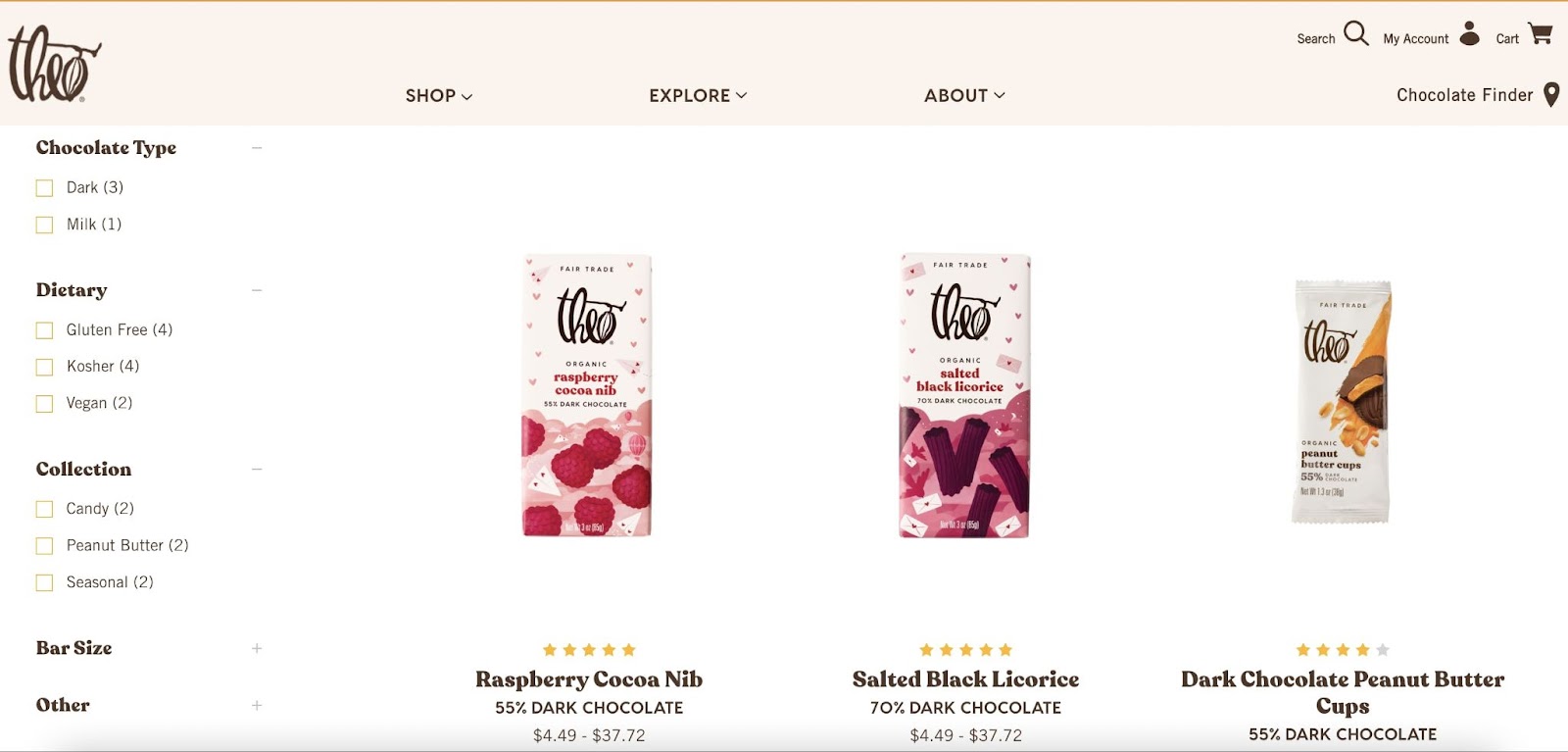
28. Theo Chocolate
Theo Chocolate offers a unique selection of organic and fair-trade chocolate products.
What It Does Right:
- High-quality content: The website combines high-quality imagery with compelling product stories, making it appealing and informative
- Good catalog organization: Theo Chocolate organizes its products effectively, allowing customers to explore their organic and fair-trade options easily
- Comprehensive product descriptions: Each chocolate product is presented with a rich description that highlights its quality and ethical sourcing
What Platform It's Built On:
- BigCommerce
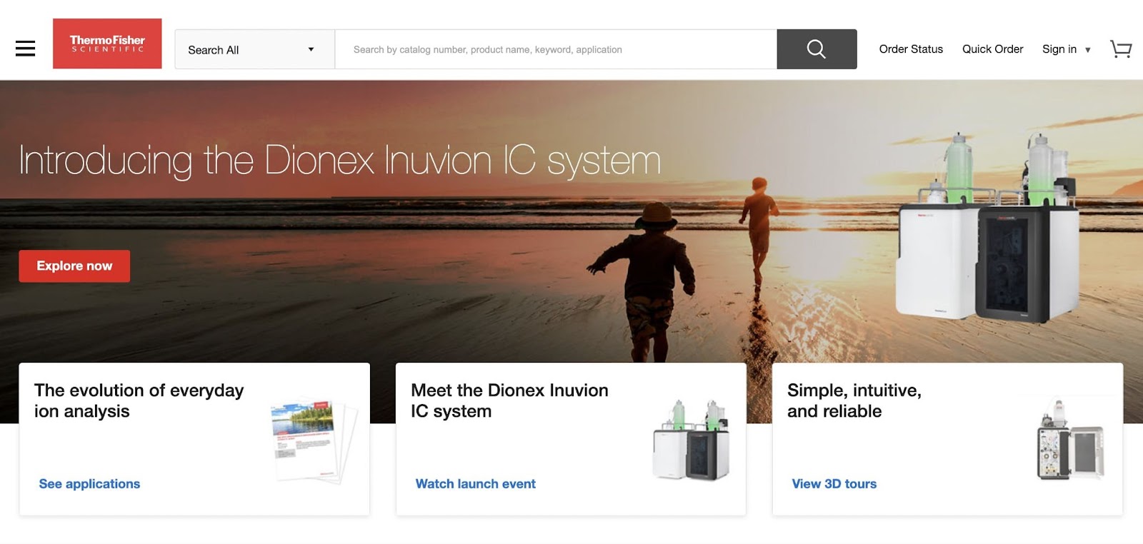
29. Thermo Fisher Scientific
Thermo Fisher Scientific is a global leader in scientific research supplies that support complex scientific endeavors.
What It Does Right:
- Comprehensive product descriptions: Thermo Fisher Scientific provides detailed descriptions and resources, making complex products more accessible
- High-quality content: The website includes in-depth support materials and learning center resources that aid in scientific research and product selection
- Responsive web design: The site ensures a seamless user experience across various devices, crucial for the scientific community
What Platform It's Built On:
- Adobe Experience Manager
30. Thomasnet
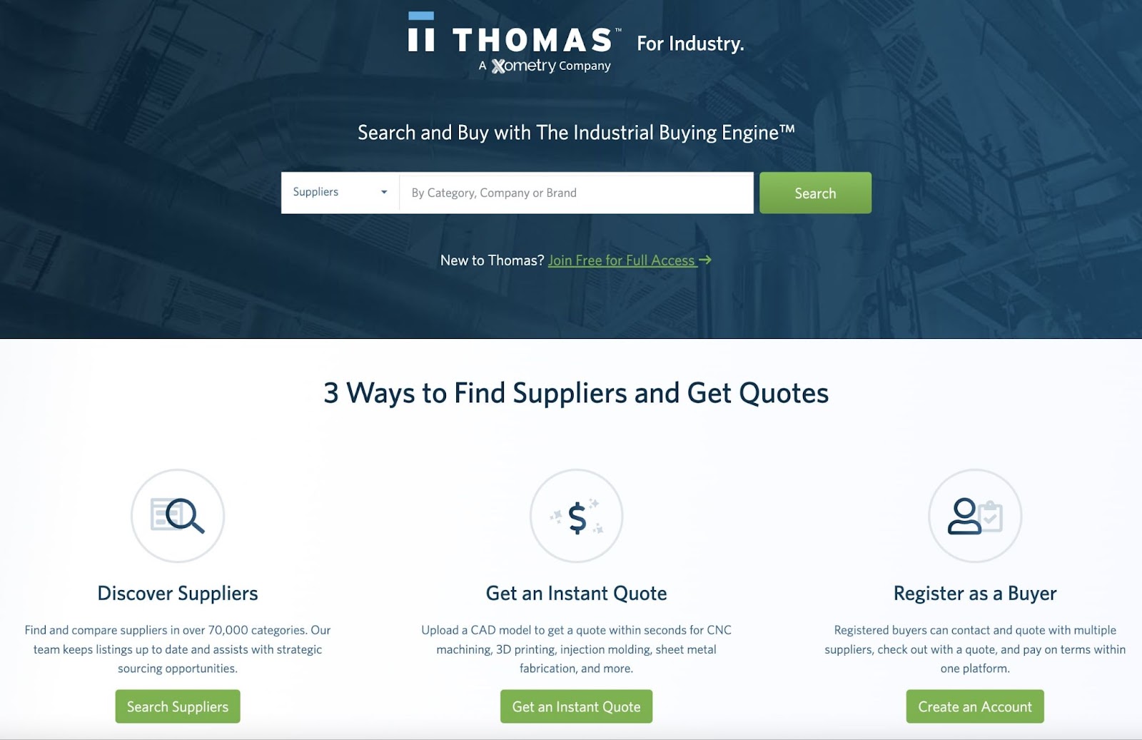
Thomasnet is a B2B platform that focuses on American industrial products and suppliers.
What It Does Right:
- Customer registration: Thomasnet allows buyers to register to keep all their supplier interactions, quotes, and payments in one place
- Detailed site search and filtering: The platform includes robust search and filtering tools that are essential for navigating its extensive industrial product range
- Great technical SEO: Thomasnet utilizes effective SEO strategies that enhance its visibility to businesses seeking industrial products via search
What Platform It's Built On:
- Amazon Web Services (AWS)
31. Tradekey
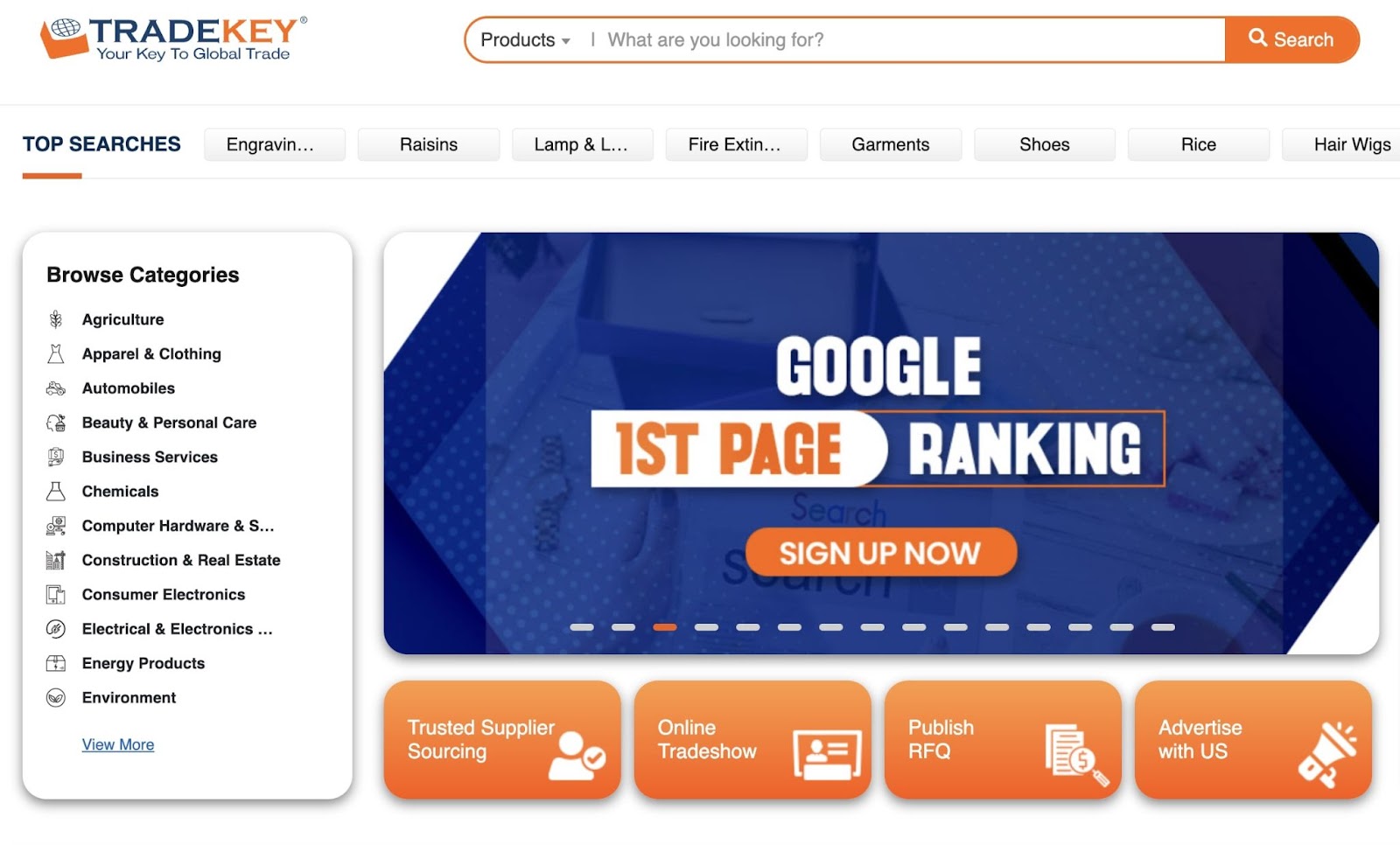
Tradekey excels as a global B2B marketplace, connecting international buyers and suppliers across industries.
What It Does Right:
- Good catalog organization: Tradekey provides a well-organized catalog that showcases a diverse range of products for global trade
- Responsive web design: The platform's design ensures accessibility and ease of use on various devices, catering to an international audience where mobile browsing is often more common
32. Tradewheel
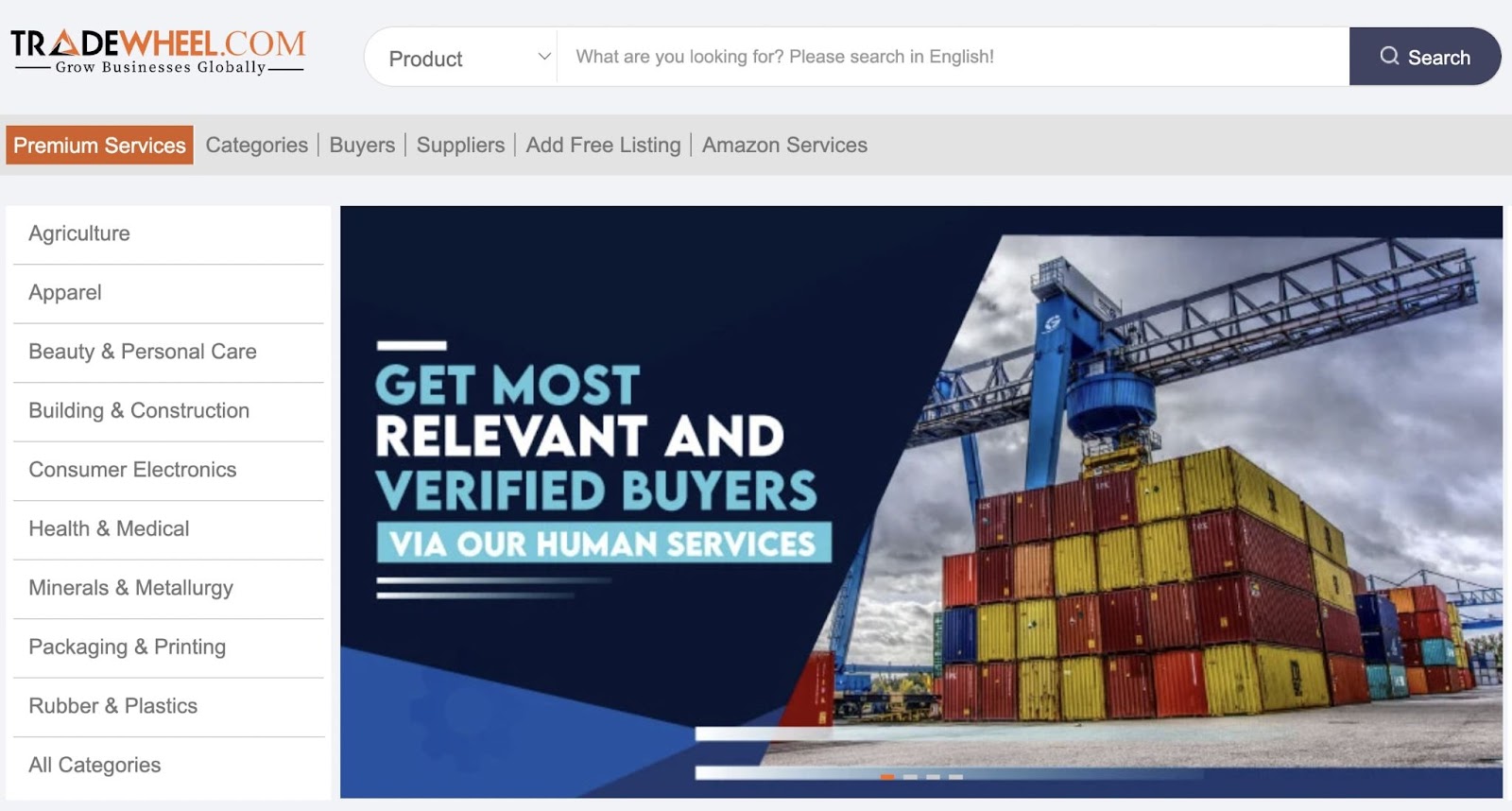
Tradewheel is a globally recognized B2B marketplace that connects global suppliers, manufacturers, exporters, buyers, traders, and importers.
What It Does Right:
- Customizable solutions: The platform offers a unique human-to-human approach by providing dedicated sales management to assist buyers at every stage, from lead generation to order closing
- Well-designed UI/UX: The website is designed for simplicity and ease of navigation for both buyers and suppliers, making it accessible and user-friendly for its massive global user base
- Good catalog organization: Featuring more than 20 million products, the website boasts a well-organized catalog with product listings and detailed descriptions that facilitate informed buying
These companies demonstrate the immense value of a well-executed ecommerce strategy. They leverage key web features to enhance user engagement and streamline the buying process.
Whether through detailed product descriptions, user-friendly interfaces, or responsive web design, successful B2B ecommerce is about meeting customer needs with precision and clarity.
For further insights and inspiration you can use to optimize your ecommerce strategy, check out the Semrush blog and sign up for a free account.
